Northwind Cloud
One design system across four acquired products
A concept study in design-system consolidation — replacing eleven button implementations and 2,847 ad-hoc colour values with a three-layer token architecture and a 48-component library.
- Project type
- Design system & component library
- Industry
- SaaS
- Timeline
- 14-week scope · 2026
- Platform
- Web applicationDesign toolingDocumentation site
- Services
- Design SystemsProduct DesignFrontend Engineering
- Technologies
- Figma VariablesVue 3TypeScriptTailwind CSSStorybook
What made this hard
Northwind Cloud is a scenario we built around the most common way enterprise design debt accumulates: not through carelessness, but through acquisition. Four products, four front-end codebases, four teams who each made locally reasonable decisions and never had a reason to agree. The cost only becomes visible the first time someone tries to ship something across all four.
Nobody made a bad decision
A 6px radius in billing and a 4px radius in observability are both defensible in isolation. There is no villain to point at, which is precisely why the problem persists — every individual choice survives review, and only the aggregate is indefensible.
Writing a new component is faster than finding the right one
This is the mechanism that generates variant twelve. As long as search costs more than reimplementation, a component library is just a thirteenth place to look. Any fix that does not change this arithmetic fails no matter how good the components are.
A shared navigation needs four implementations
The trigger for the scenario. Northwind wants one navigation bar across all four surfaces, and discovers that shipping it means writing it four times and maintaining it four times, forever.
Consistency is not the business case
Leadership does not fund tidiness. The case has to be made in delivery time and in the cost of the next cross-product feature, which means the system has to be measurable from the first week.
The situation we designed against
We started from an audit rather than a workshop, because the argument for a design system is usually lost in the abstract and won on a spreadsheet. The figures below are the scenario's premises — we chose them to sit at the plausible end of what a four-product estate looks like after three acquisitions.
- 2,847 unique colour values
- Roughly 60% within one perceptual step of another value already in use. Different hexes nobody can tell apart, each one a decision someone made under deadline.
- 31 spacing scales
- Not 31 values — 31 distinct scales, several of which disagree about whether the base unit is 4px or 5px.
- Eleven button implementations
- Across four repositories, with divergent hover states, focus treatments and disabled semantics. Three of them are inaccessible by keyboard.
- The complaint is discoverability, not aesthetics
- Engineers in this scenario do not say the UI looks inconsistent. They say they cannot find the component they need, so they write one.
- Design and engineering disagree on what "done" means
- A designer considers a component done when the Figma variant set is complete. An engineer considers it done when it is merged and typed. Neither is wrong; the gap is where drift enters.
- There is no budget for a freeze
- All four products keep shipping throughout. Any migration plan that requires a feature freeze is not a plan.
The people we designed for
Dana Okonjo
Staff Frontend Engineer, Billing
Ships two or three features a sprint against a codebase she inherited from an acquired team. She is the person who would adopt the system, and the person who will route around it if it slows her down.
“I am not writing another button because I want to. I am writing one because I have twenty minutes and I already spent fifteen looking.”
Goals
- Ship a feature without a three-day detour into component archaeology
- Stop getting design-review comments about spacing she did not choose
- Delete code rather than add it
Frustrations
- Four repositories to search, none with a shared naming convention
- Components that exist but are undocumented, so their variants are unknown
- Being told to "use the design system" when the system has no billing table
Ilse Brandt
Product Designer, Platform
Maintains the Figma library that three other designers draw from, and spends more of her week answering implementation questions than designing. She is the system's author and its bottleneck.
“I have published the same explanation of our focus states eleven times. I have counted.”
Goals
- Change a token once and see it land in all four products
- Spend review time on interaction, not on radius values
- Have a documented answer she can link to instead of retyping
Frustrations
- Every question a docs site would answer arrives as a direct message
- Her library and the shipped code drift apart within a sprint
- No way to see which components are actually being used
Where the current experience loses them
Scroll the map horizontally to see every stage.
Why "build us a component library" was the wrong brief
The brief this scenario opens with is a component library. It is the brief most consolidation projects get, and taking it literally is how you end up with variant twelve.
A library is a supply-side fix. It assumes the problem is that good components do not exist, so it makes them exist. But the failure mode in a four-product estate is not scarcity — Northwind has plenty of buttons, and several of them are good. The failure is that finding the right one costs more than writing a new one, and a library does nothing about that arithmetic. It adds a thirteenth place to look.
So the thing we designed is not a library. It is three separate mechanisms that happen to ship together: a token architecture that makes a rebrand cheap, a component contract that makes drift expressible only through review, and a migration plan that replaces the old code rather than sitting beside it. Remove any one of them and the other two decay within two quarters.
The three-layer bet
The core structural bet is the semantic layer, and it is worth being honest that it is a bet.
The obvious architecture is two layers: a palette, and components that use it. It is simpler, it is easier to read, and it works fine until the first time anyone needs a second theme. At that point every component holds a decision that should have been held centrally, and there are 48 places to make the same edit.
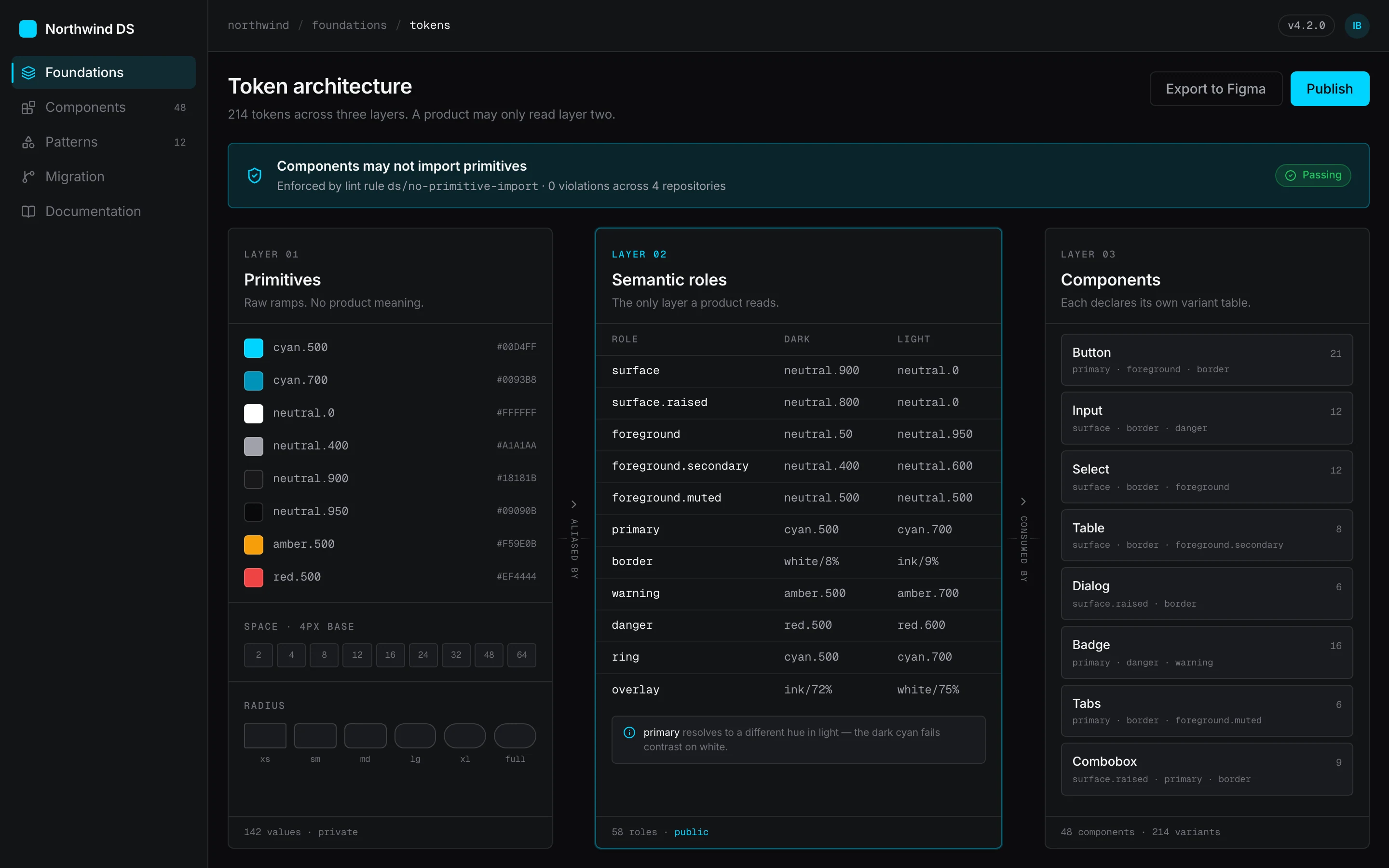
The three-layer version costs a hop. Button asks for primary, primary
resolves to cyan-500 in dark and to a different hue entirely in light — not a
lighter step of the same one, because the bright cyan that carries a near-black
surface measures under 2:1 against white and is unreadable as a 1px border. That
substitution is invisible to every component, which is the point, and it is also
the thing that makes the light theme a token edit instead of a redesign.
What we gave up is legibility at the call site. You cannot read a component and know what colour it renders. New contributors find this genuinely irritating, and the honest defence is only that the alternative is worse at the scale where it matters.
Migration as the deliverable
The part of this plan most likely to be cut is the four paired migration weeks, so it is scoped in from week one rather than proposed as a follow-up.
The reasoning is arithmetic. Codemods handle the mechanical transformations — raw values to token references, spacing literals to scale steps — which is most of the volume and none of the judgement. What is left is roughly 30% of the work, and every item in it needs a decision: this table is close enough to the system table to migrate, that one is genuinely different and needs a variant, a third should not exist at all.
Those decisions are fast when someone who knows the system sits next to someone who knows the product, and they are indefinitely slow when they sit in a backlog belonging to a team with its own roadmap. A half-migrated estate is worse than an unmigrated one, because now there are two right answers.
Where this would strain
Three places, stated plainly because a case study with no failure modes is a brochure.
The variant-request turnaround is load-bearing. The contract only holds if adding a legitimately new variant is fast. At a two-day turnaround teams will use it; at two weeks they will find the override that still works, and the table stops being a contract. Nothing in the architecture enforces the SLA — it is a staffing commitment wearing a technical hat.
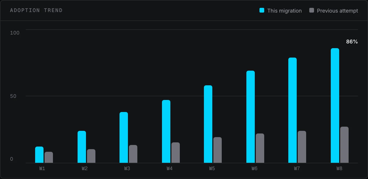
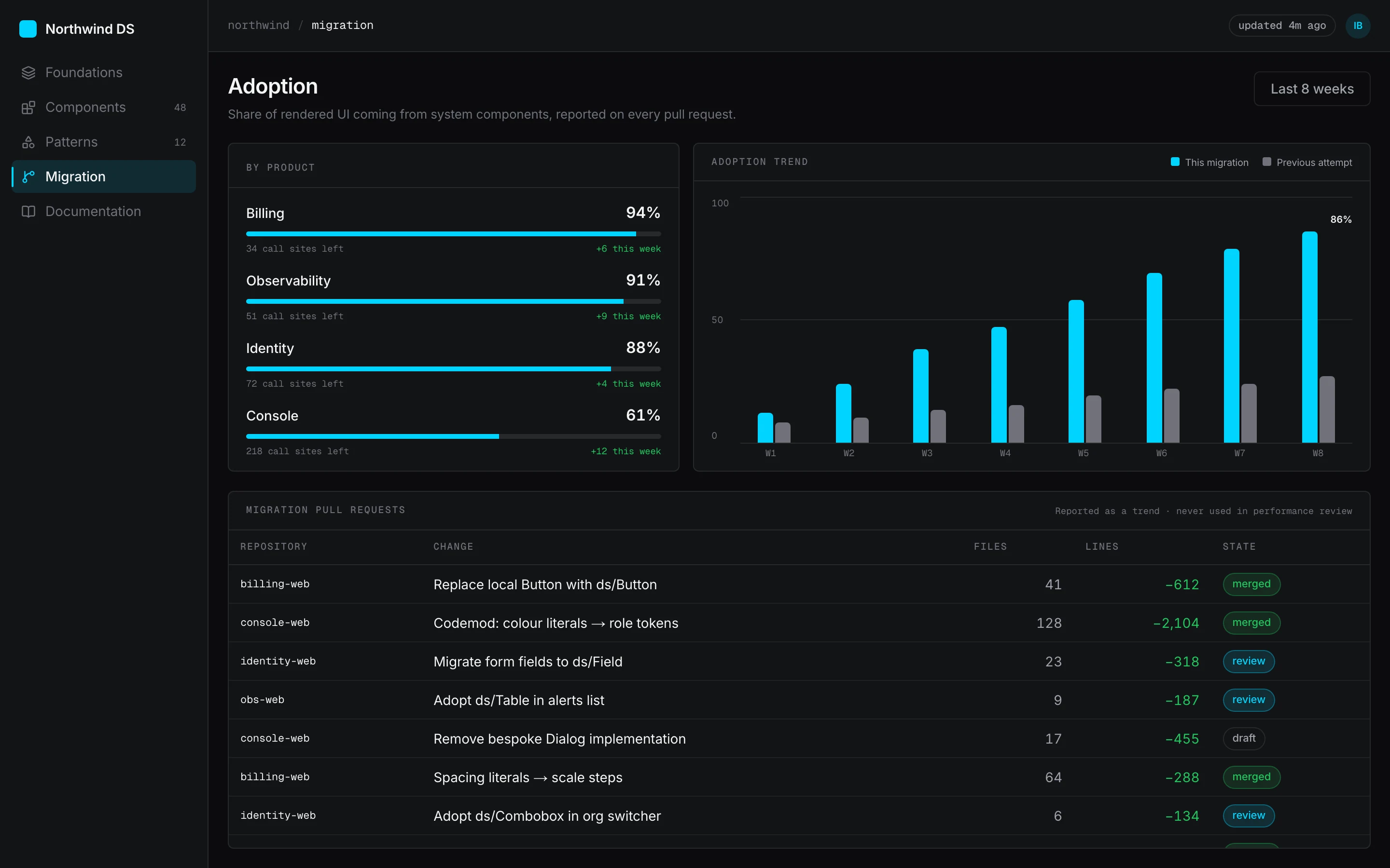
The adoption metric is gameable. Wrapping a bespoke component in a system container raises the number without improving anything. Reporting it as a trend rather than a target, and keeping it out of performance review, is the only mitigation, and it is a social one.
Four products may not actually want one system. The scenario assumes enough overlap to justify shared components, and that assumption deserves testing before the investment. If the billing product's tables and the observability product's tables have genuinely different requirements, the honest answer is two systems on shared tokens — a much smaller, much less impressive project that would be the right one.
What we decided before drawing anything
Products consume roles, never raw values
A component asks for `surface` or `border-subtle`, never `#18181B`. This is the constraint that makes a rebrand a one-layer edit, and it is worth the indirection it costs a reader.
If a variant is not in the table, it does not exist
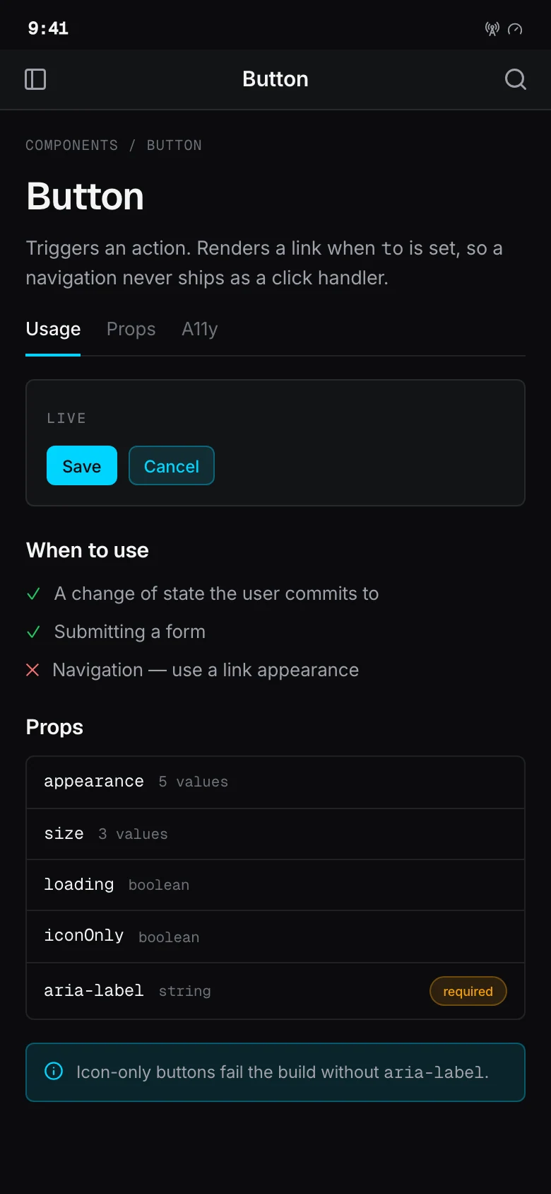
Each component declares its full variant, size and state matrix in one place. Consumers cannot invent a thirteenth style with a class override, which is what stopped the drift the library alone would not have.
Migration is the deliverable
A system that does not replace the old code is a thirteenth way to build a button. Codemods, a tracked backlog and paired migration weeks are in scope from week one, not scheduled afterwards.
Documentation ships before the component
Written first, it forces the API to be explainable. Written last, it documents whatever got built.
Adoption is measured, not assumed
CI reports the share of rendered UI coming from system components on every pull request. Without a number, "adoption" is a feeling that leadership correctly discounts.
The system serves the products, not the reverse
A component that only exists because the system wanted symmetry is overhead. Every entry earns its place by replacing something real.
How the product was reorganised
Layer one — primitives
Raw palette ramps, type scale, spacing units. No product meaning, changes almost never.
Colour ramps
11 steps per hue, generated, never referenced by a component
Type scale
Nine steps with paired line-height and tracking
Space & radius
A single 4px base unit and a six-step radius ramp
Layer two — semantic roles
The only layer a product reads. Flips wholesale between themes and brands.
Surface roles
background, surface, surface-raised, overlay
Content roles
foreground, secondary, muted, inverse
Intent roles
primary, danger, warning, success — each with a paired foreground
Layer three — components
48 components, each with a declared variant table and accessibility contract.
Primitives
Button, Input, Select, Checkbox, Badge, Avatar
Composites
Table, Dialog, Drawer, Combobox, DatePicker
Patterns
Page shell, empty state, form layout, data grid
Distribution
One published artifact consumed identically by design tooling and every front-end.
Figma library
Variables generated from the same token source as the code
npm package
Versioned, with codemods shipped alongside breaking changes
Documentation site
Live specimens, props tables, and the do/do-not for each component
Before and after, step for step
Using a component on a new screen
The nine-step version is not a process anyone designed. It is what happens when discovery is unsupported, and it is the flow the system has to beat on cost rather than on virtue.
9 to3steps, −6
Before
- Read spec
- Grep local repo
- Grep three other repos
- Ask in Slack
- Wait for reply
- Open Figma to read values
- Copy raw hex and spacing
- Write a local variant
- Fix review comments
After
- Search one index
- Import component
- Pass props from the variant table
Changing the brand colour
The before path is not hypothetical drudgery — it is the reason rebrands get deferred for years in estates like this one.
5 to2steps, −3
Before
- Find every hex across four repos
- Judge which are the brand colour
- Replace by hand
- Miss the ones inside SVGs
- Regression-test four products
After
- Edit the semantic layer
- Rebuild
Adding a variant that does not exist yet
Deliberately not frictionless. The point is that the friction now produces a shared component instead of a private one.
2 to3steps
Before
- Override with a class
- Ship
After
- Open a system pull request
- Add the variant to the table
- Release, then consume
The choices that shaped the product
Each of these could reasonably have gone the other way. What follows is the argument for the direction taken, and what it gave up.
A semantic layer between primitives and components
With components reading the palette directly, every theme, brand or contrast variation means touching all 48 of them. The alternative — one set of role names in the middle — costs the reader a hop.
What we did
Components may only reference semantic roles. The primitive ramps are private to the token build, and a lint rule fails any component that imports one.
Why
It converts a 48-file change into a one-file change, and it makes the light theme possible at all: several roles resolve to a *different* hue in light mode, not a lighter step of the same one, because the dark-mode accents fail contrast on a white surface.
What it cost
Reading a component no longer tells you what colour it is. Debugging goes through one extra indirection, and new contributors reliably find this annoying for their first fortnight.
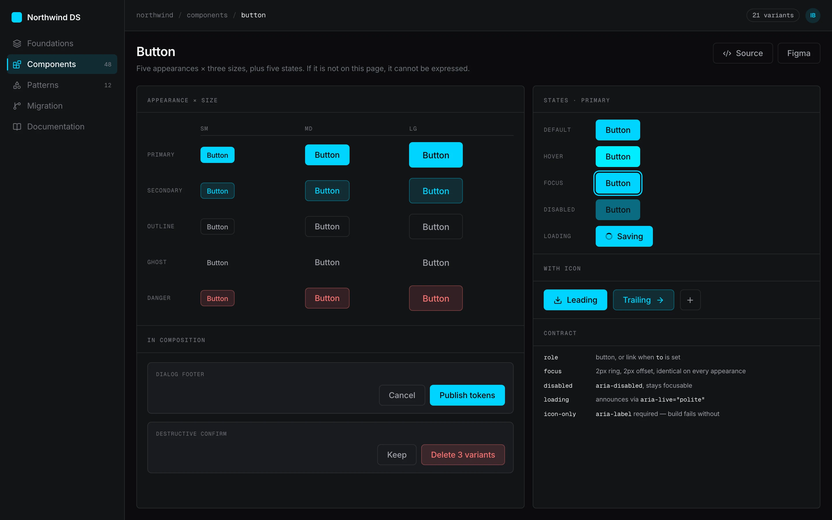
The variant table is the component's contract
A component that accepts arbitrary class overrides has no API — it has a suggestion. That is how eleven buttons became eleven buttons, each one technically a customisation of the last.
What we did
Every component declares its variants, sizes and states in one table. Anything not in the table cannot be expressed, and `class` is merged through a conflict-aware resolver so intentional overrides still win predictably.
Why
It moves the decision about whether a new style should exist from the moment of maximum deadline pressure to a review where someone can ask whether four products need it.
What it cost
Genuinely one-off needs now require a system pull request. We budgeted a two-day turnaround on variant requests specifically so this does not become the reason teams route around the system.
Codemods for the mechanical 70%, pairing for the rest
Migration is where design systems die. A backlog of 2,800 replacements assigned to teams with their own roadmaps will not be finished, and a half-migrated estate is worse than an unmigrated one.
What we did
Ship codemods with the system for the mechanical transformations — raw values to token references, spacing literals to scale steps — and schedule one paired week per product team for the remainder.
Why
The mechanical part is most of the volume and none of the judgement. The remaining 30% needs a decision per case, and a person from the system team sitting with the product team makes those decisions in minutes.
What it cost
Four paired weeks is a real cost, and it is the line item most likely to be cut. We put it in the initial scope rather than the follow-up precisely because a follow-up budget does not survive a reprioritisation.
Adoption reported in CI, not in a survey
"Are people using it?" is the question that decides whether the system gets a second year of investment, and it is usually answered with anecdote.
What we did
Every pull request reports the share of rendered UI coming from system components, and the figure goes on a dashboard the engineering leads already look at.
Why
It makes drift visible on the day it happens rather than at the next audit, and it gives the system team an argument that does not depend on anyone's goodwill.
What it cost
Any measure that becomes a target gets gamed. A team can raise the number by wrapping a bespoke component in a system container, so the figure is reported as a trend and never used in performance review.
Documentation written before the component
In the first draft of this plan the docs site was the last milestone. For six weeks the only reference would have been Figma, which means engineers asking designers questions a page would have answered.
What we did
The documentation page for a component is written and reviewed before the component is built, and the page is what gets reviewed.
Why
An API you cannot explain in three paragraphs is usually wrong. Writing first surfaced four components whose props only made sense to the person who designed them.
What it cost
Some rework, because a few APIs changed after the docs were written. Less than we expected, and cheaper than the alternative.
Key screens
The system underneath the screens
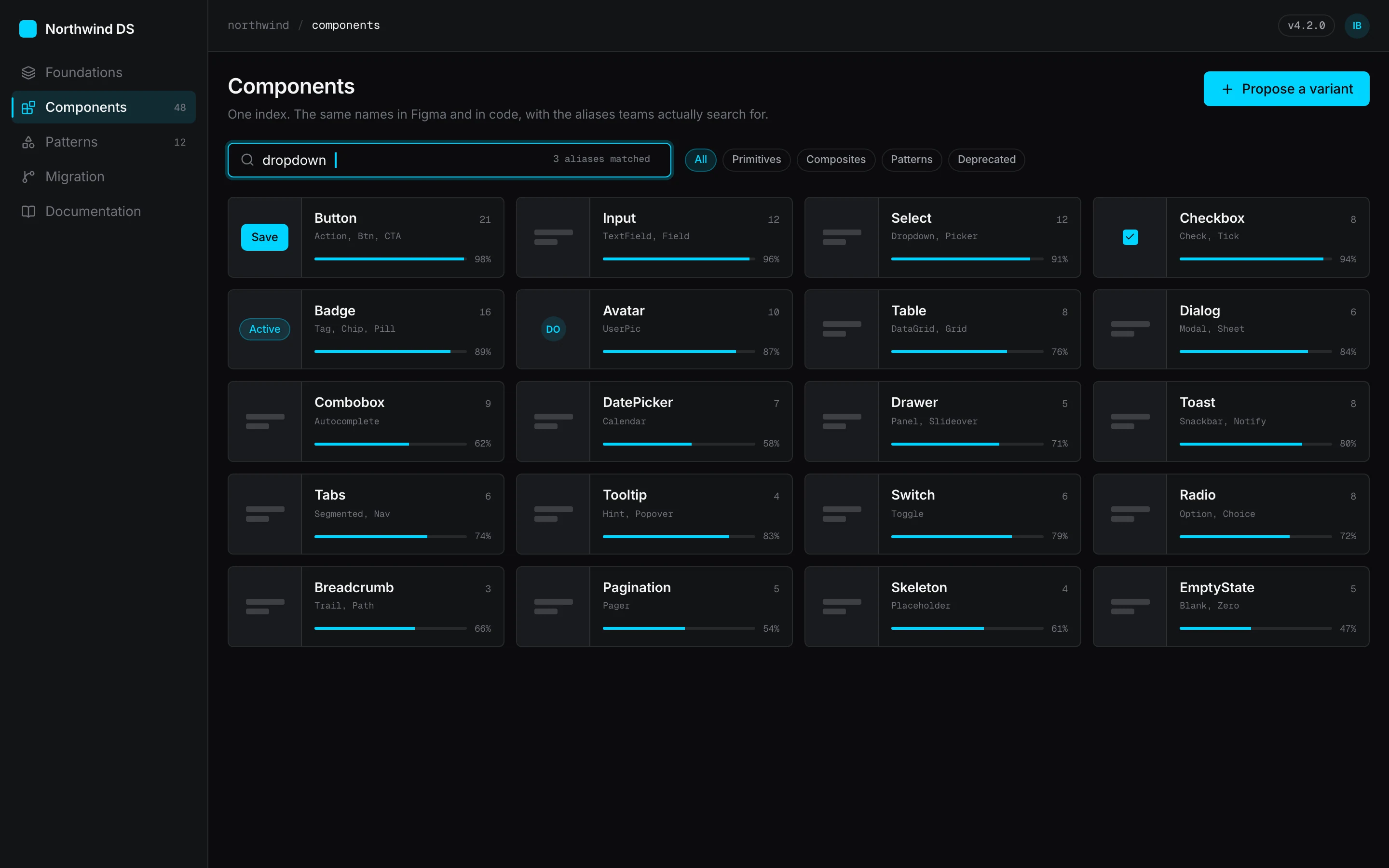
Three token layers, 48 components and one distribution artifact. The specimens below are rendered live from this project's own token values rather than exported as images — a screenshot proves someone drew a button, a rendered specimen proves the button is generated by a system with parameters.
Colour
- Ink#0B0C0EPrimary surface in the dark theme
- Signal#00D4FFPrimary action, dark theme only
- Signal (light)#0093B8The same role restepped — the bright cyan fails contrast on white
- Slate#71717ASecondary text and the reference series in charts
- Amber#F59E0BWarning state, paired with an icon and never used alone
Typography
- DisplayPage titles and empty-state headings2.5rem · 600
- TitleSection and dialog headings1.5rem · 600
- BodyDefault running text and table cells0.9375rem · 400
- LabelForm labels, buttons and dense table headers0.8125rem · 500
- MonoIdentifiers, token names and code0.8125rem · 400
Tokens
- --space-unit
- 4px
- Every spacing step is a multiple. No exceptions, no half-steps.
- --radius-control
- 6px
- Buttons, inputs and selects. Containers use 10px.
- --control-height
- 36px
- The single height every interactive control aligns to.
- --border-hairline
- 1px
- All dividers and container edges at every density.
- --duration-quick
- 180ms
- State transitions. Anything longer feels broken on a dense screen.
- --focus-ring
- 2px solid
- Offset by 2px, identical on every focusable element.
Components
6 components · 75 variants
- Button21Seven appearances × three sizes, plus loading, disabled and icon-only states.
- Input12Three sizes × four validation states, each with a described error region.
- Select12Native and combobox modes, with full keyboard navigation.
- Table8Three densities, sortable and selectable columns, virtualised body.
- Dialog6Focus trap, scroll lock and focus restore, in three widths.
- Badge16Eight tones × two sizes. Status tones always carry an icon.
Rendered specimens
What shipped
Three-layer token architecture
Primitives, semantic roles and component tokens, generated from one source into CSS custom properties, TypeScript constants and Figma variables.
48-component library
Each component declares its variants, sizes, states and keyboard contract in a single table that also generates its documentation.
Migration codemods
Shipped with the system rather than after it, covering the mechanical transformations that make up roughly 70% of the replacement work.
Adoption reporting in CI
Every pull request reports the share of rendered UI coming from system components, so drift is visible the day it appears.
Generated Figma variables
The design library is built from the same token source as the code, so the inspector emits role names instead of raw hexes.
Documentation site with live specimens
Components render as themselves on the page, so the docs cannot drift from the implementation the way a screenshot can.
What the work changed
These describe the design itself. Because this is a concept project with no users, there are no adoption, retention or revenue figures on this page — those would have to be invented, and an invented number is worth less than none.
- 11 → 1
- Button implementations
- Eleven divergent buttons across four codebases, expressed as one component whose variant table is its contract.
- 214
- Tokens across three layers
- Primitives, semantic roles and component tokens — replacing the 2,847 unrelated raw values the scenario audit assumes.
- 48
- Components specified
- Each with its variants, states, keyboard behaviour and accessibility contract declared in a single table.
- 1
- Layer a rebrand touches
- Products consume semantic roles only. Changing the brand is an edit to layer two, not a search across four repositories.
- 3
- Steps to use a system component
- Down from nine in the modelled current-state flow — see the flow comparison below.
- 4 → 1
- Sources of truth
- One published library, consumed identically by design tooling and every front-end.
Next study
Meridian Health
Designing an AI that clinicians are allowed to disagree with
HealthcareYour product
Have a problem shaped like one of these?
Northwind Cloud is a concept. If you are working on something with the same kind of complexity, tell us what is not working and we will tell you how we would approach it.
Or email us directly at hello@uxatom.com