Meridian Health
Designing an AI that clinicians are allowed to disagree with
A concept study in clinical AI interface design — rebuilding a triage review surface around provenance, calibrated uncertainty and a disagreement path that costs no more than agreement.
- Project type
- AI product design & interaction model
- Industry
- Healthcare
- Timeline
- 11-week scope · 2026
- Platform
- Clinical web applicationTablet, bedside
- Services
- AI Product DesignProduct DesignProduct Strategy
- Technologies
- FigmaReactTypeScriptFHIR
What made this hard
The scenario starts from the uncomfortable finding that keeps recurring in deployed clinical AI: a model can be accurate and still be ignored. Meridian has a triage model with strong validated performance and a review interface that clinicians route around. The interesting question is not how to make the model better. It is what an interface owes a professional who will have to defend the decision to a colleague, a regulator, or a coroner.
Accuracy is not the same as usability
A recommendation that is right 94% of the time is still unusable if a clinician cannot tell which case they are in. Aggregate accuracy is a property of the model; per-case confidence is a property of the interface, and only the second one helps at the bedside.
An unexplained recommendation is not evidence
Clinicians are trained and required to justify decisions. A severity score with no indication of what in the record produced it cannot enter that justification, whatever its track record.
The interface made the safe action expensive
In the current state, accepting is one click and disagreeing costs a modal, a taxonomy that does not fit real cases, and a free-text box. That asymmetry is a design decision, and it pushes toward automation bias every hour of every shift.
Precision theatre erodes trust
Rendering confidence as "87%" implies a calibration the model does not have. Clinicians who notice this stop believing the number; clinicians who do not notice are misled by it. There is no audience it serves.
Every interaction is an audit record
Whatever the interface captures is what exists in two years when someone asks why a decision was made. Designing the capture is designing the legal record.
The situation we designed against
The premises below are the scenario we chose, drawn from the failure patterns that recur across published clinical decision-support deployments. They are assumptions we committed to and designed against, not findings from clinicians we spoke to — there were none.
- The model is good and still ignored
- We deliberately set the model's validated accuracy high. If the recommendation were often wrong, the design problem would be trivial and uninteresting: fix the model. Assuming it is right isolates the interface problem.
- Most rejections are not disagreements
- We assume clinicians decline to engage with the recommendation far more often than they actively judge it wrong. Disengagement and disagreement look identical in the telemetry and need completely different fixes.
- Confidence is read categorically
- We assume any percentage above roughly 80 collapses in the reader's mind to "the computer thinks yes", erasing the gradient the number exists to convey.
- The recommendation arrives before the clinician has formed a view
- Current-state placement shows the model's answer at the top of the case. We assume this anchors the clinician's own assessment, which is the thing least recoverable once it happens.
- Disagreement is the most valuable signal in the system
- A clinician who overrides the model with a reason is generating the highest-quality training and safety data available. The current design taxes exactly that behaviour.
- Regulatory scrutiny is a design input, not a constraint added later
- The interface must produce a defensible record by default, without the clinician doing anything extra to make it defensible.
The people we designed for
Dr. Yusuf Adeyemi
Emergency triage clinician
Works a twelve-hour shift with a queue that never empties, seeing each case for a few minutes. He is not hostile to the model — he simply cannot spend ninety seconds working out where a number came from.
“I do not need it to be right. I need to be able to say why I did what I did, and right now it cannot help me with that.”
Goals
- Reach a defensible decision quickly and move to the next case
- Know when the model is on firm ground and when it is guessing
- Leave a record that explains itself without extra typing
Frustrations
- A severity score with no indication of what drove it
- Disagreeing takes four interactions; accepting takes one
- The model's answer appears before he has read the case himself
Marielle Koch
Clinical Safety Lead
Owns the incident review process and signs off the deployment. She is the person who will be asked to reconstruct a decision eighteen months after it was made, from whatever the interface happened to store.
“If the only thing we stored is that someone clicked accept, we have not stored a decision. We have stored a click.”
Goals
- Reconstruct any decision from the record alone
- See where the model and clinicians systematically diverge
- Demonstrate that no action was taken without a person in the loop
Frustrations
- Override reasons captured as a taxonomy that fits few real cases
- No record of what the model showed, only what it concluded
- Disengagement and disagreement are indistinguishable in the data
Where the current experience loses them
Scroll the map horizontally to see every stage.
The problem is not accuracy
The scenario deliberately gives Meridian a good model. That is the only way to see the interface problem clearly.
If a recommendation is often wrong, the design question is uninteresting: fix the model, and in the meantime make it easy to ignore. The hard and much more common case is a model that is usually right and still does not change what anyone does. At that point the failure is entirely in the space between the model's output and a professional's ability to act on it — which is the interface, and nothing else.
What a clinician needs from a recommendation is not a conclusion. It is material for a justification they will have to give later, possibly under scrutiny, from memory, about a case they saw for four minutes eighteen months ago. A severity score cannot enter that justification. It is not that clinicians distrust the number; it is that the number is not the kind of thing that can be cited.
Reversing the reading order
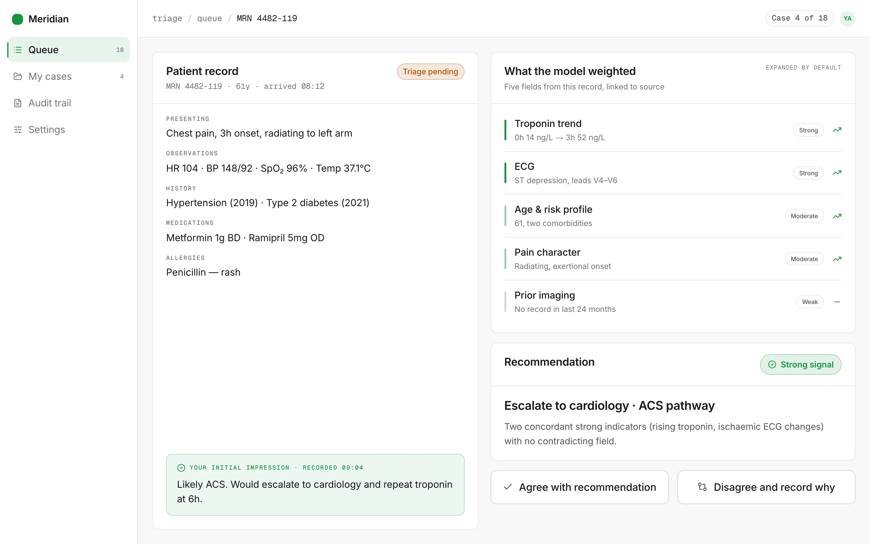
Almost everything in the design follows from one inversion: lead with the evidence, let the conclusion follow.
The current state shows a recommendation and hides the reasoning behind a navigation. That ordering casts the clinician as a reviewer of the model's output — their job is to accept or reject something already decided. Showing the weighted record fields first casts them as the decision-maker, with the model as a colleague who has read the chart and has a view.
The second framing is both more accurate and safer. It is more accurate because the clinician is the decision-maker, legally and clinically. It is safer because reasoning that is visible can be checked, and a conclusion that arrives alone can only be trusted or not.
This is also why the evidence panel is expanded by default rather than behind a disclosure. A panel that must be opened is a panel that goes unopened on the shift where it would have mattered most.
The step we added on purpose
Every other decision here removes work. One adds it, and it is the one worth defending.
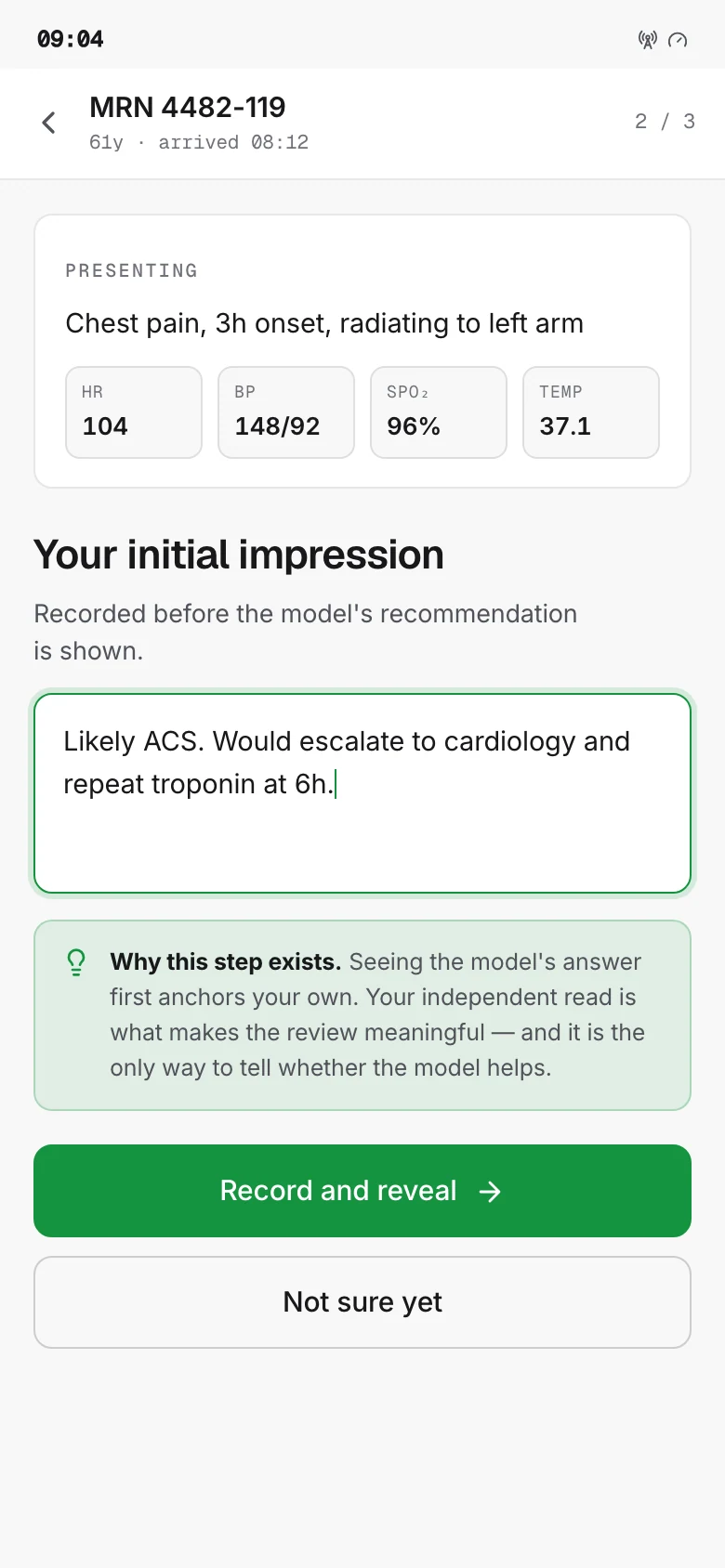
The initial impression — a brief recorded read before the model's output is revealed — costs a step on every case. On a full queue that is real time, and it is the first thing that will be proposed for removal when throughput is under pressure.
The argument for keeping it is that without it, the human in the loop is decorative. Anchoring is not a bias people can notice in themselves and correct for; the whole mechanism is that the anchored judgement feels like an independent one. If the clinician sees the model's answer before forming a view, their agreement carries almost no information, and the safety case built on "a clinician reviewed every recommendation" is hollow.
So the step buys two things: an independent read, and a dataset of human assessments formed without model influence — which is, incidentally, the only honest way to measure whether the model is helping.
We wrote that reasoning into the interface itself rather than leaving it in a design document, because the person who eventually proposes removing the step will not read the design document.
What we are least sure about
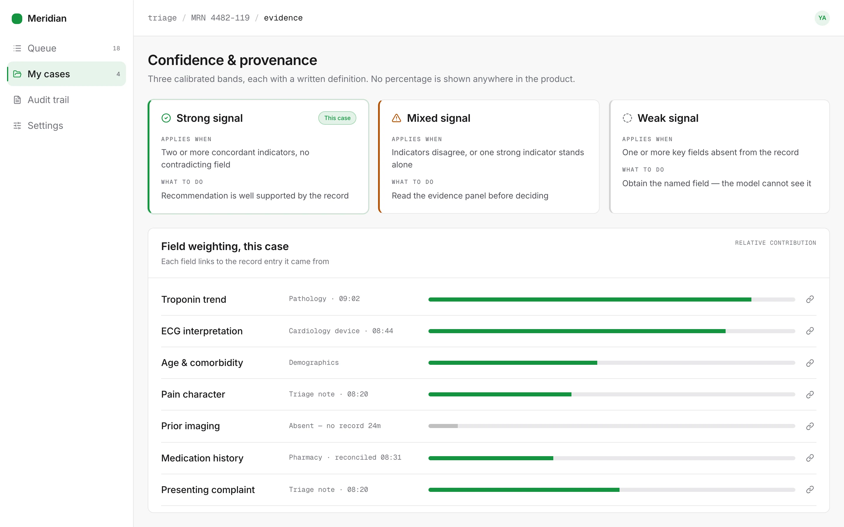
Three bands may be too few. Collapsing a continuous confidence into three states throws away real information, and a clinician who was reading the gradient correctly is worse served. The defence is that most were not, but that is an assumption in this scenario, not a measurement. With real calibration data the right answer might be four bands, or bands that vary by pathway.
Free text will be hard to live with. It is the honest choice and it is genuinely worse for anyone who needs to count things. Clustering approximates what a taxonomy would have given exactly, and approximate analysis of true reasons beats exact counts of false ones — but the safety lead will feel that trade every quarter.
Symmetric actions have a real cost. Removing the default removes the keyboard fast-path, and on routine cases experienced clinicians will find the new surface slower than the old one. That is the correct trade for a safety property, and it is still a cost that someone pays on every shift.
What we decided before drawing anything
Provenance before conclusion
The interface leads with the record fields the model weighted and lets the recommendation follow from them. A conclusion presented first is something to accept or reject; evidence presented first is something to reason with.
Uncertainty is content
Confidence gets the same typographic weight and the same permanence as the recommendation. It is not a tooltip, a footnote or a colour — it is part of what the model is saying.
Disagreement must cost what agreement costs
Any asymmetry between the two paths is a thumb on the scale, applied thousands of times a week. Equal affordance is a safety property, not a courtesy.
The model argues, it never acts
No recommendation writes to the record, schedules anything, or proceeds on a timeout. Every state change passes through a person.
Do not anchor the clinician
The recommendation is withheld until the clinician records an initial impression. This costs a step and buys an independent read, which is the entire value of having a clinician in the loop.
The audit record is a design deliverable
What the interface captures by default is what will exist when someone reconstructs the decision. It must be complete without anyone trying.
How the product was reorganised
Case queue
The clinician's working list, ordered by their own triage rules rather than by model confidence.
Queue filters
By acuity, wait time and location — never by what the model thinks
Case card
Shows presenting complaint only; no model output at list level
Review surface
One screen holding the record, the evidence, the recommendation and both actions.
Record summary
History, observations, medications — the clinician's own read
Initial impression
Captured before the recommendation is revealed
Evidence panel
The record fields the model weighted, each linked to its source
Recommendation
Pathway, calibrated confidence band, and the caveat that applies
Decision
Two equally weighted actions, plus the free-text reason that feeds the audit record.
Agree
Records agreement and the evidence shown at the time
Disagree
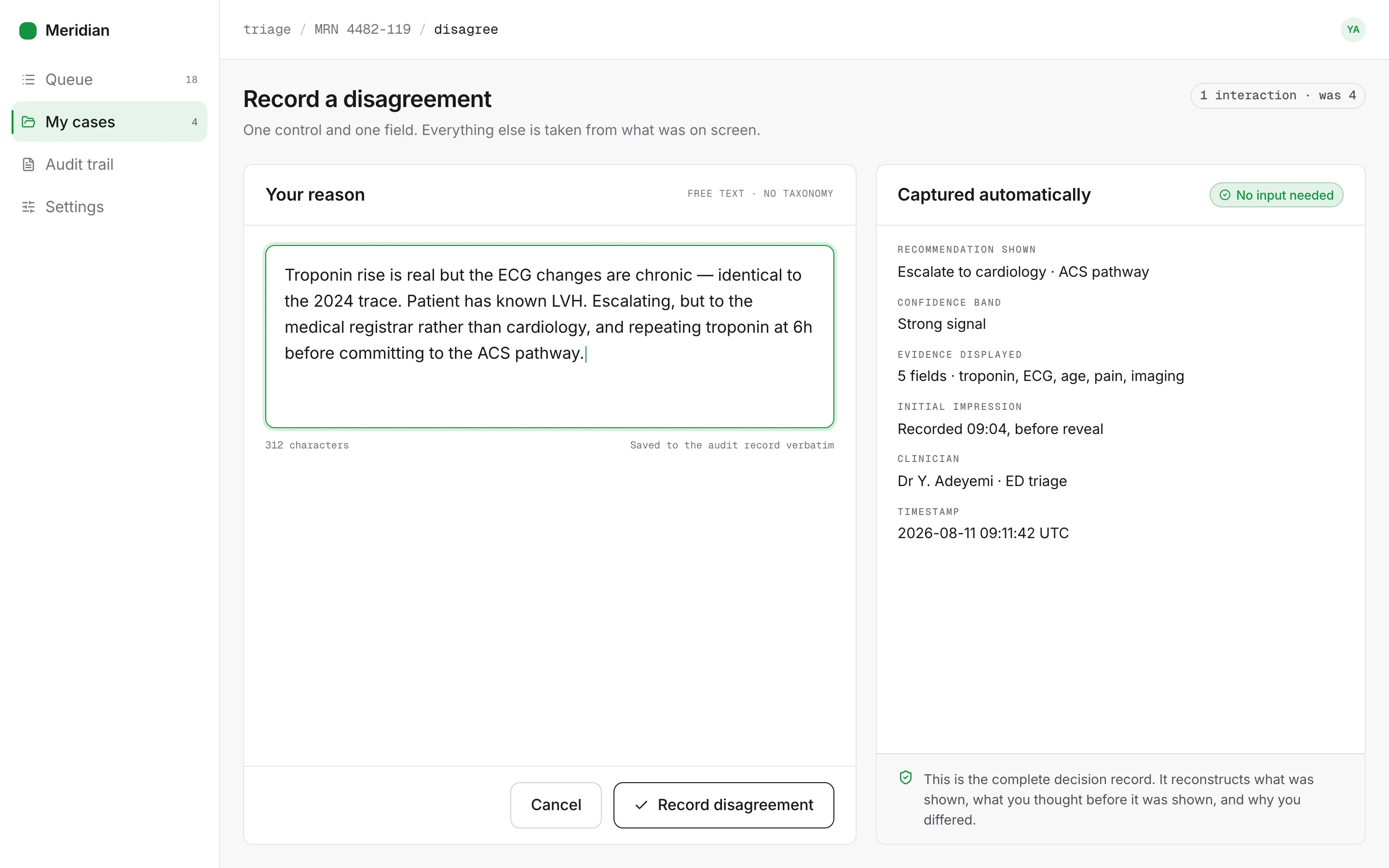
One control, free-text reason, no taxonomy
Audit trail
For the safety lead rather than the clinician — reconstructs any decision from stored state.
Decision replay
Exactly what was on screen when the decision was made
Divergence view
Where clinicians systematically override, grouped by reason
Before and after, step for step
Recording a disagreement
This is the flow the whole project turns on. Every interaction removed here makes the safest action cheaper, thousands of times a week.
6 to2steps, −4
Before
- Click reject
- Open modal
- Choose a taxonomy reason
- Type a justification
- Confirm
- Dismiss modal
After
- Click disagree
- Type the reason inline
Understanding why the model said this
In the current state the reasoning is not in the product. Moving it in is most of the work.
5 to1steps, −4
Before
- Read the score
- Open the model information page
- Read the model card
- Return to the case
- Reconstruct which fields might apply
After
- Read the evidence panel, open by default
Working a case end to end
The redesigned flow is one step longer, and deliberately so — the initial impression is the step that stops the model anchoring the clinician.
4 to5steps
Before
- Open case
- See recommendation
- Read record
- Accept
After
- Open case
- Read record
- Record initial impression
- Reveal evidence and recommendation
- Agree or disagree
The choices that shaped the product
Each of these could reasonably have gone the other way. What follows is the argument for the direction taken, and what it gave up.
Three calibrated bands instead of a confidence percentage
"87% confident" implies a precision the model cannot support and is read categorically anyway. Both the readers who trust it and the readers who discount it end up worse off than with no number.
What we did
Confidence renders as one of three bands — strong signal, mixed signal, weak signal — each with a fixed, written definition of what the model does and does not have in that state.
Why
Three bands can be calibrated honestly and learned once. They also force a genuinely useful distinction the percentage hid: "weak signal" means the record is missing something, which is directly actionable in a way that "62%" is not.
What it cost
Real information is discarded. A clinician who did read the gradient correctly loses resolution, and edge cases near a band boundary get rounded. We judged the loss smaller than the harm of false precision, but it is a genuine loss and it should be revisited with calibration data.
Evidence panel open by default
Reasoning behind a disclosure is reasoning nobody reads under time pressure, and the whole argument for this redesign is that an unjustifiable recommendation is unusable.
What we did
The record fields the model weighted are shown expanded, above the recommendation, each linked to the source it came from.
Why
It makes the recommendation checkable in the few seconds a clinician actually has, and it changes the reading order from "here is a conclusion, do you accept it" to "here is what I looked at, here is what I conclude".
What it cost
Significant vertical space on a screen that is already dense, and for experienced users on routine cases it is noise. A collapse control exists, but it does not persist between cases — we chose the cost of re-collapsing over the risk of a permanently hidden evidence panel.
Withhold the recommendation until an initial impression is recorded
Showing the model's answer first anchors the clinician's own assessment. Anchoring is invisible to the person it happens to, and it silently removes the independent judgement that justifies having a human reviewer.
What we did
The clinician records a brief initial impression, then the evidence and recommendation are revealed together.
Why
It preserves an independent read, and as a side effect it produces exactly the dataset the safety lead needs — every case now carries a human assessment formed without model influence.
What it cost
This is the most expensive decision on the page. It adds a step to every case, and on a shift with a full queue that is real time. It is also the decision most likely to be removed under throughput pressure, which is why the rationale is written into the interface rather than left in a design document.
Equal affordance for agree and disagree
When accepting is one click and rejecting is six, the interface has an opinion, and it applies that opinion at scale. Automation bias does not need much help.
What we did
Both actions are the same size, the same weight, the same distance from the pointer, and neither is a default. Neither is styled as primary.
Why
Removing the asymmetry removes a systematic bias from thousands of decisions a week. It also improves the data: an override is now cheap enough to record honestly rather than skipped.
What it cost
No default action means no keyboard fast-path for the common case, and experienced users on routine cases will find it slower. We accepted that cost; a default here is a thumb on the scale by construction.
Free text instead of an override taxonomy
A fixed reason list is faster to analyse and almost never fits the case in front of the clinician, so it collects whichever option is least wrong. That is worse than no data, because it looks like data.
What we did
One free-text field, with the structured fields — which evidence was shown, which band, what the initial impression was — captured automatically.
Why
The structure comes from state the interface already has, so it costs the clinician nothing and is accurate. The part only a human can supply is left as prose, where it is honest.
What it cost
Free text is expensive to analyse in aggregate and cannot be counted directly. The divergence view groups it with clustering, which is approximate and needs review — we preferred approximate analysis of true reasons over exact counts of false ones.
Key screens


The system underneath the screens
A restrained, high-legibility system for a screen read under time pressure at arm's length. The distinguishing decisions are a calm status ramp that never uses colour alone, generous type at bedside distance, and a confidence band component that is the only place uncertainty is expressed.
Colour
- Slate ink#0D1117Primary surface, dark theme
- Vital#22C55EAgreement and strong-signal states, dark theme
- Vital (light)#15943FThe same role restepped for the light theme
- Neutral#71717ASecondary text, and the reference series in charts
- Caution#F59E0BMixed signal — always paired with an icon and a word
Typography
- Case titlePatient and case identifiers1.75rem · 600
- RecommendationThe model's conclusion and the confidence band1.25rem · 600
- BodyRecord text, read at arm's length on a bedside tablet1.0625rem · 400
- EvidenceLinked record fields inside the evidence panel0.9375rem · 400
- MetaTimestamps, authorship and audit references0.8125rem · 500
Tokens
- --band-strong
- signal ≥ 2 concordant
- Strong signal. Definition is a token so the UI and the model share one rule.
- --band-weak
- missing ≥ 1 key field
- Weak signal — states what is absent rather than emitting a low number.
- --action-parity
- true
- Enforces identical geometry for agree and disagree. Asserted in tests.
- --evidence-default
- expanded
- The evidence panel's initial state. Collapse never persists across cases.
- --touch-target
- 44px
- Minimum for gloved use on a bedside tablet.
- --auto-actions
- 0
- A build-time assertion, not a preference. Nothing acts without a person.
Components
6 components · 29 variants
- ConfidenceBand3The single place uncertainty is expressed. Icon, word and colour, in that order.
- EvidenceItem6A weighted record field linked to its source, with the direction of its contribution.
- DecisionBar2Agree and disagree at identical weight. No primary variant exists.
- RecordSection9Collapsible record regions with a persistent summary line.
- CaseCard4Queue entry. Deliberately carries no model output.
- AuditEntry5Immutable decision record, replaying exactly what was on screen.
Rendered specimens
What shipped
Calibrated confidence bands
Three states with fixed written definitions, replacing a percentage that was read categorically anyway.
Provenance-first review surface
The record fields the model weighted, linked to source, shown above the recommendation and expanded by default.
Anchor-resistant reveal
The recommendation is withheld until the clinician records an independent initial impression.
Symmetric decision bar
Agree and disagree at identical weight, with no default and no primary styling on either.
Zero-cost audit capture
Structured audit fields are taken from interface state, so a complete record is produced without the clinician doing anything extra.
Divergence analysis
Overrides clustered by reason, surfacing where the model and clinical judgement systematically part company.
What the work changed
These describe the design itself. Because this is a concept project with no users, there are no adoption, retention or revenue figures on this page — those would have to be invented, and an invented number is worth less than none.
- 4 → 1
- Interactions to record disagreement
- A modal, a taxonomy select and a free-text justification collapsed into one inline control that captures the same audit data.
- 100%
- Recommendations carrying provenance
- Every recommendation links the specific record fields that drove it. Previously none did.
- 3 bands
- Replacing a confidence percentage
- A calibrated three-band scale, because "87% confident" was read as either meaningless or falsely precise.
- 9 → 4
- Screens in the review path
- Reasoning, evidence and history moved into the review surface instead of sitting behind separate navigations.
- 2
- Actions with equal affordance
- Accept and disagree are the same size, the same distance from the pointer, and neither is the default.
- 0
- Automatic actions
- The model never writes to the record. It argues; a person decides.
Next study
Ledgerly
Rebuilding onboarding around the first useful moment
FintechYour product
Have a problem shaped like one of these?
Meridian Health is a concept. If you are working on something with the same kind of complexity, tell us what is not working and we will tell you how we would approach it.
Or email us directly at hello@uxatom.com