Fleetwise
A fleet dashboard people stop exporting to spreadsheets
A concept study in dense operations tooling — replacing a 40,000-row logistics dashboard's single-select filter bar with a composable query, saved views and side-by-side comparison, so the spreadsheet stops winning.
- Project type
- Data-dense product design & front-end architecture
- Industry
- Logistics
- Timeline
- 12-week scope · 2025
- Platform
- Web applicationOperations floor, large displays
- Services
- Dashboard DesignProduct DesignFrontend Engineering
- Technologies
- FigmaVue 3TypeScriptTanStack TableTailwind CSS
What made this hard
Fleetwise is a scenario about a product that works exactly as specified and is still losing to Excel. The dashboard can display 40,000 active shipments. It simply cannot do the three things an operator does with them, so the operator exports and does the real work elsewhere. The design problem is not the visual design of the dashboard; it is that the interaction model stops at "display".
The product had become a download button
The most-used control on the page is Export to CSV. Operators load the dashboard, immediately export, and work in a spreadsheet. Every feature built downstream of that click is unused by definition.
One filter at a time, against multi-condition questions
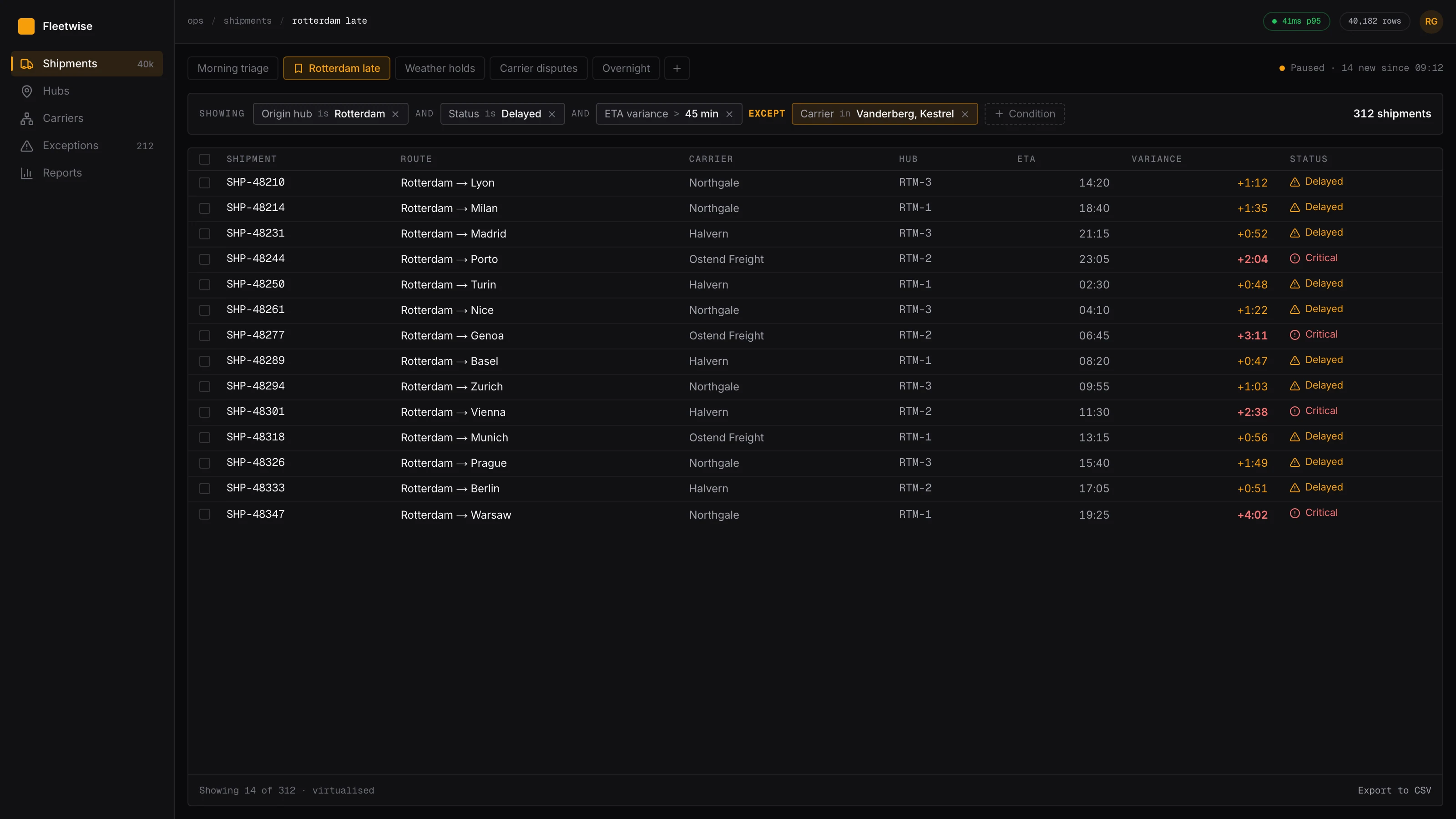
Real operational questions are compound — late shipments from one hub, excluding two carriers already known to be in a weather delay. A single-select filter bar cannot express the question, so it cannot be asked.
The dashboard forgets everything on refresh
Each operator has four or five recurring questions they ask daily and rebuild by hand every morning. The product has no memory of work that repeats every single day.
Comparison is impossible
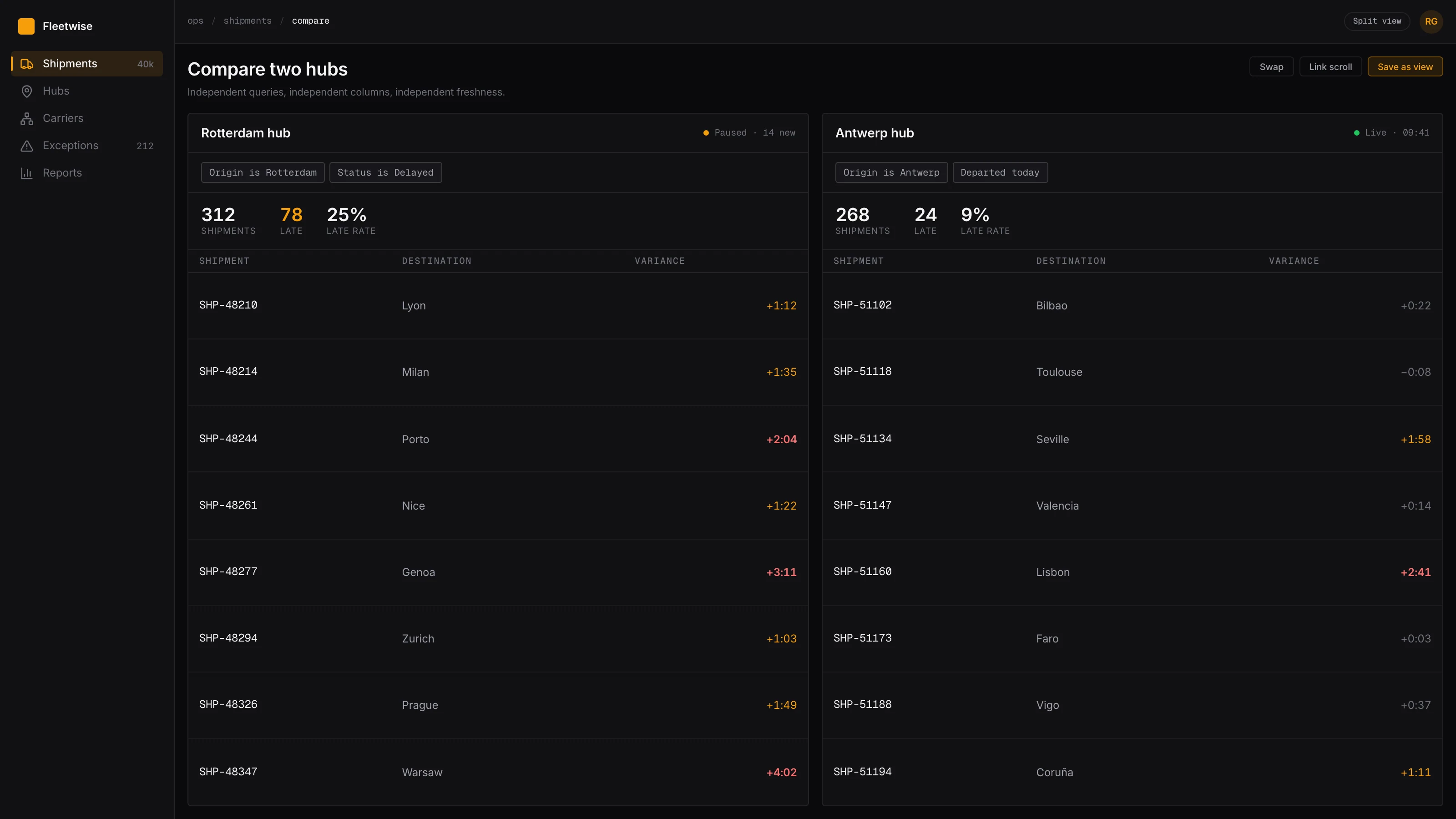
Operators need two filtered sets beside each other. The product shows one, which is why the second spreadsheet window exists.
Latency sets a floor under everything
Sorting takes seconds and filtering re-fetches from the server. At that cost exploration stops — nobody experiments with a query that makes them wait, so the interaction model is constrained by the data layer before any design decision is made.
The situation we designed against
The premises are drawn from the recurring pattern in operations tooling: the spreadsheet is not winning because it is better designed, but because it is composable, persistent and fast. Those three properties are the actual competitor, and they are the brief.
- The spreadsheet is the real competitor
- Not another vendor. Any feature that does not beat Excel on composition, persistence or speed will be routed around, however well it is drawn.
- Operators ask compound questions
- Two to four conditions, frequently including an exclusion. Exclusions matter disproportionately — "except the ones I already know about" is most of what expertise looks like on an operations floor.
- The same four or five questions recur daily
- Per operator, stable over months. This is the strongest signal in the scenario: work that repeats daily and is rebuilt by hand every time.
- Comparison is a first-class task
- Not an advanced feature. Two sets side by side is how an operator decides where to spend the next hour.
- Sub-100ms filtering changes behaviour, not just satisfaction
- Below roughly a tenth of a second, operators explore. Above it they plan a query before running it, and exploration stops being possible.
- Export should remain, and stop being the first action
- Some downstream uses are legitimate. Success is export moving from the first click to a deliberate late one, not disappearing.
The people we designed for
Renske de Groot
Operations controller, Rotterdam hub
Runs a shift watching 40,000 active shipments on two monitors, deciding continuously where attention is worth spending. She built a personal spreadsheet system years ago and it works.
“I already know about the weather in Lyon. I need the list that excludes it, and there is no way to say that to this thing.”
Goals
- Ask a compound question without planning it in advance
- Return to the same five views every morning without rebuilding them
- Compare two hubs side by side while a call is happening
Frustrations
- One filter at a time, against questions that need four
- Everything lost on refresh
- A three-second sort that makes exploration not worth attempting
Idris Mahmood
Network operations lead
Does not work the floor. Reviews patterns across hubs weekly and needs the same view the controllers are looking at, not an approximation of it rebuilt in a reporting tool.
“Someone sends me a screenshot and a paragraph explaining which filters they used. That paragraph should have been a link.”
Goals
- See exactly what a controller saw when they escalated
- Compare this week against last on the same query
- Share a view without describing how to reconstruct it
Frustrations
- Views cannot be shared, only described in a message
- Reporting tool and dashboard disagree because the filters differ
- No way to tell whether a number is current or stale
Where the current experience loses them
Scroll the map horizontally to see every stage.
Read the most-used control
The diagnosis in this scenario takes one number: the most-used control on the dashboard is Export to CSV.
That single fact reframes the project. It means the product is not a dashboard that needs improving — it is a query interface people cannot use, wrapped around a data export they can. Every feature downstream of that click is unreachable by definition, and any redesign that makes the dashboard prettier improves the part nobody stays on.
It also names the competitor. Fleetwise is not losing to another vendor. It is losing to Excel, and Excel is winning on three specific properties: you can compose arbitrary conditions, the file persists, and it responds instantly. Those three are the brief. None of them is a visual design problem.
Composability has a floor, and the floor is latency
The condition builder is the centrepiece, and it only works if the table is fast.
This is the part that makes it an engineering project as much as a design one. A composable query encourages exploration — add a condition, look, remove it, try another. That loop is the entire value. At a hundred milliseconds it is a loop; at three seconds it is a series of decisions, and an operator who has to decide before each query will plan carefully and try two things instead of twenty.
So the interaction budget is a design requirement expressed in milliseconds, and it forces an architectural choice: load the working set once and filter on the client. That decision buys the exploration loop and costs a heavier initial load, a large client-side working set, and data that can be stale between refreshes.
The staleness is why freshness is displayed per view rather than as one global timestamp. Having chosen an architecture that permits stale data, hiding that fact would be indefensible.
It is also worth saying where this stops working. At 400,000 rows the client cannot hold the working set and the whole model has to change — server-side query with an optimistic client cache, or a fundamentally different interaction that does not assume instant feedback. This design does not stretch to that; it would need to be replaced.
Views are the real unit
The condition builder gets the attention, but saved views are probably the larger win.
The strongest signal in the scenario is that each operator has four or five questions they ask every single morning and rebuild by hand every single time. That is work the product watches happen daily and refuses to remember.
The important decision is what a view contains. A saved filter restores the query and loses the columns, the sort and the density — about a third of the work, which is more irritating than restoring nothing, because the user has to notice what is missing and then fix it. A view therefore carries the entire state, and is addressable by URL, which as a side effect turns an escalation from a screenshot plus a paragraph of reconstruction instructions into a link.
The hidden cost is versioning. Views reference columns, and columns change. Every view needs to degrade gracefully and offer a repair rather than breaking, which is a substantial piece of engineering that shows up as no visible feature at all. It is the sort of thing that gets cut in week nine and regretted in month four.
Leaving the escape hatch open
Export stays exactly where it is.
There is an argument for removing it — force the habit change, make the new tools the only path. It would improve adoption on paper. It is also punishing users for a shortcoming that was the product's, and some downstream uses of an export are perfectly legitimate.
The better reason to keep it is diagnostic. If export remains the first click after the redesign, then the composable query did not work, and that is worth knowing plainly rather than obscuring by closing the alternative. A metric you have removed the option to fail is not a metric.
What we decided before drawing anything
The spreadsheet is the competitor
Every decision is measured against composition, persistence and speed — the three properties that make Excel win. Beating it on visual design is not a goal and would not help.
Any question the data supports must be expressible
If an operator can describe a filter in a sentence, the interface must let them build it. Curated filter presets are a way of deciding in advance which questions are allowed.
Exploration requires sub-100ms feedback
This is an interaction-design requirement expressed as a performance budget. Above the threshold, users plan queries instead of exploring, and no amount of interface quality recovers it.
Everything is addressable
A view is a URL. Sharing a question should never mean describing how to reconstruct it.
State is never silently lost
Query, columns, sort, density and scroll position survive a refresh. A product that forgets daily work is telling the user their work is not worth remembering.
Show staleness rather than hiding it
A number with an unknown age is worse than an old number that says how old it is. Every view carries its own freshness.
How the product was reorganised
Query
The composable layer that replaced the filter bar. Reads left to right as a sentence.
Condition
Field, operator, value — each removable independently
Grouping
and/or nesting, one level deep, shown structurally
Exclusions
First-class, because "except the ones I know about" is most of the job
Views
A saved query plus everything around it. The unit operators actually work in.
Personal views
The four or five daily questions, pinned
Shared views
Addressable by URL, so an escalation is a link
Comparison
Two independent queries side by side in one surface
Table
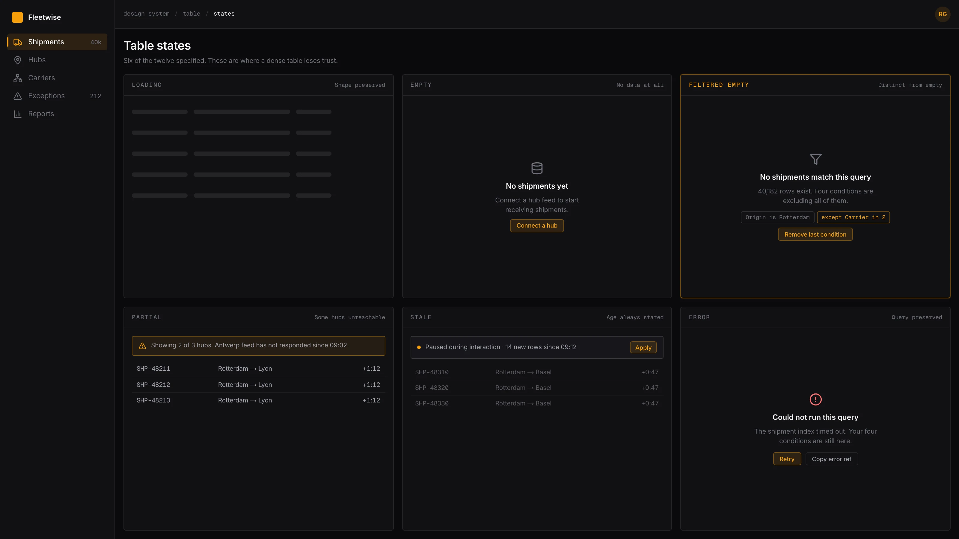
Virtualised, dense, with the states most dense tables omit.
Column set
Chosen per view, not globally
Density
Three steps, persisted with the view
States
Loading, empty, filtered-empty, error, partial, stale
Freshness
Every view states its own age and refresh behaviour.
Age indicator
Per view, not a single global timestamp
Live or paused
Explicit, because live updates during triage are hostile
Before and after, step for step
Asking a compound question
The before column is not a worse way of doing the same thing — the question genuinely cannot be expressed, so it gets approximated and the approximation is what gets acted on.
5 to3steps, −2
Before
- Apply the one filter that fits best
- Export to CSV
- Open the spreadsheet
- Add an autofilter
- Add the remaining conditions
After
- Add condition
- Add condition
- Add exclusion
Starting a shift
Rebuilt by hand every morning in the current state, for work that is identical every day.
5 to1steps, −4
Before
- Open dashboard
- Re-apply four filters
- Re-choose columns
- Re-apply sort
- Set density
After
- Open the pinned view
Escalating something to the network lead
A view being addressable turns a paragraph of reconstruction instructions into a link.
4 to2steps, −2
Before
- Screenshot the spreadsheet
- Write out which filters were used
- Send both
- Answer follow-up questions about the filters
After
- Copy the view URL
- Send it
Comparing two hubs
Not an advanced feature — it is how the next hour gets allocated.
4 to2steps, −2
Before
- Export hub A
- Export hub B
- Open two spreadsheet windows
- Arrange them side by side
After
- Split the view
- Set the second query
The choices that shaped the product
Each of these could reasonably have gone the other way. What follows is the argument for the direction taken, and what it gave up.
A composable condition builder instead of curated filter presets
Presets are easier to design, easier to explain and cover the common cases. They also decide in advance which questions may be asked, and the questions that matter on an operations floor are the unusual ones.
What we did
A stackable field/operator/value builder with one level of and/or grouping, rendered along the top of the table so it reads as a sentence. Each condition is removable independently.
Why
It makes the expressible set match the answerable set. The sentence rendering is what keeps it usable — a query builder that looks like a query builder gets used by three people, one that reads as a line of English gets used by everyone.
What it cost
Higher floor than presets. A new operator faces an empty builder rather than a menu of good starting points, and one level of grouping still cannot express genuinely nested logic. Shared views are the mitigation for the first problem; the second is a deliberate cap, because two levels of nesting is where these interfaces become unreadable.
Saved views carry everything, not just the filter
A saved filter that restores the query but not the columns, sort or density restores about a third of the work, which is somehow more annoying than restoring none of it.
What we did
A view is the full state — query, column set, order, sort, density and live/paused — addressable by URL and shareable.
Why
It matches the unit operators actually think in. Nobody wants "the late shipments filter"; they want "my morning view", and the difference between those two is everything except the filter.
What it cost
Views drift as the schema changes. A view referencing a removed column has to degrade rather than break, which means every view carries versioning and a repair path — a meaningful chunk of the build that produces no visible feature.
Client-side filtering over a virtualised 40,000-row body
Server-side filtering means a round-trip per interaction. At a hundred milliseconds or more, operators plan queries instead of exploring, and the composable builder loses most of its value.
What we did
Load the working set once, filter and sort on the client against a virtualised table body, and reconcile with the server on an explicit refresh.
Why
It puts the interaction under the exploration threshold, which is what makes the query builder worth having. Below that threshold operators try things; above it they do not.
What it cost
A real architectural cost. The client now holds a large working set, the initial load is heavier, and the data can be stale between refreshes — which is precisely why staleness is displayed per view rather than assumed. This decision would not survive a jump to 400,000 rows, and the design would need to change rather than stretch.
Live updates are opt-in, per view
A real-time dashboard sounds obviously correct and is hostile during triage. Rows moving under the pointer while an operator works a list is the fastest way to lose their place and their trust.
What we did
Views are paused by default during interaction. New data is announced as a count — "14 new since 09:12" — and applied when the operator asks.
Why
It separates knowing that something changed from having the ground move. The operator keeps control of when their working set is disturbed, and still knows immediately that it is out of date.
What it cost
Someone will look at a stale view and believe it is current. The age indicator on every view is the mitigation, and it is not a complete one — this is a genuine safety trade made in favour of not disrupting active work.
Keep Export to CSV, and stop measuring it as a feature
Export is the symptom, and removing it to force adoption punishes the user for the product's shortcomings. Some downstream uses are also entirely legitimate.
What we did
Export stays, unchanged and easy to find, and is treated as a diagnostic signal rather than a feature to promote.
Why
Its position in the interaction order is the honest measure of whether the redesign worked. If it remains the first click, the composable query has failed, and that is worth knowing without ambiguity.
What it cost
Leaving the escape hatch open means some operators never change their habit, and habit is strong after years. Closing it would produce better adoption numbers and worse information.
Key screens


The system underneath the screens
A compact, high-density system built for a shift spent scanning. Small radii, tight control heights, hairline rules instead of zebra striping, and a status ramp deliberately held apart from the categorical chart hues so a neutral data series never reads as a warning.
Colour
- Console#0A0A0CPrimary surface, dark theme — the floor runs dark all shift
- Signal#F59E0BPrimary action and the subject series in charts, dark theme
- Signal (light)#B45309The same role restepped — bright amber is unreadable on white
- Reference#71717ASecondary text, and the comparison series in every chart
- Exception#DC2626Reserved for exceptions. Never used as a categorical series colour.
Typography
- MetricHeadline counts, always tabular1.75rem · 600
- HeadingPanel and view titles1.125rem · 600
- BodyTable cells at default density0.875rem · 400
- DenseTable cells at compact density, where most of a shift is spent0.8125rem · 400
- IdentifierShipment references and codes, monospaced for scanning0.8125rem · 400
Tokens
- --row-height-compact
- 28px
- Compact density. Fits roughly 40 rows on a floor monitor.
- --interaction-budget
- 100ms
- A budget, asserted in CI. Above it, exploration stops.
- --grid-line
- hairline
- Row separation. Zebra striping doubles the ink for no added legibility.
- --numeric-align
- right
- Every numeric column, with tabular figures. Non-negotiable.
- --status-ramp
- reserved
- Held apart from categorical hues so a series never reads as a warning.
- --live-default
- paused
- Views do not move under the pointer unless asked.
Components
6 components · 39 variants
- DataTable12Three densities, virtualised body, and the loading, empty, filtered-empty, error, partial and stale states.
- ConditionRow9Field, operator and value across six field types, including exclusions.
- ViewTab5Saved view with its own freshness indicator and live/paused state.
- SplitPane3Two independent queries side by side, each with its own column set.
- FreshnessBadge4Age, pending-change count and refresh affordance, per view.
- SeriesChart6Subject and reference series only. One axis, always.
Rendered specimens
What shipped
Composable condition builder
Stackable field/operator/value conditions with and/or grouping and first-class exclusions, rendered as a readable sentence.
Saved and shareable views
Query, columns, sort, density and live state as one addressable unit, with a repair path when the schema moves under them.
Side-by-side comparison
Two independent queries in one surface, each with its own column set and freshness.
Virtualised 40,000-row table
Client-side filtering and sorting under a 100ms interaction budget asserted in CI.
Twelve specified table states
Including filtered-empty, partial and stale — the states that are usually left to chance and are where dense tables lose credibility.
Per-view freshness with opt-in live updates
Views pause during interaction and announce pending changes as a count rather than reordering rows under the pointer.
What the work changed
These describe the design itself. Because this is a concept project with no users, there are no adoption, retention or revenue figures on this page — those would have to be invented, and an invented number is worth less than none.
- 1 → n
- Simultaneous filter conditions
- A single-select filter bar replaced by a stackable condition builder with and/or grouping.
- 2
- Filtered sets visible at once
- A split view for the comparison operators previously did by opening two spreadsheet windows.
- 0
- Views lost on refresh
- Saved views persist the full query, column set, sort and density, and are shareable by URL.
- 40,000
- Rows held at interactive latency
- Virtualised body with client-side filtering, so exploration does not cost a server round-trip per keystroke.
- 4 → 1
- Screens to answer a recurring question
- The daily questions operators asked became saved views on one surface instead of four navigations.
- 12
- Table states specified
- Loading, empty, filtered-empty, error, partial, stale and six selection states — the ones dense tables usually omit.
Next study
Verdigris
An e-commerce system where every product is one of one
E-commerceYour product
Have a problem shaped like one of these?
Fleetwise is a concept. If you are working on something with the same kind of complexity, tell us what is not working and we will tell you how we would approach it.
Or email us directly at hello@uxatom.com