Verdigris
An e-commerce system where every product is one of one
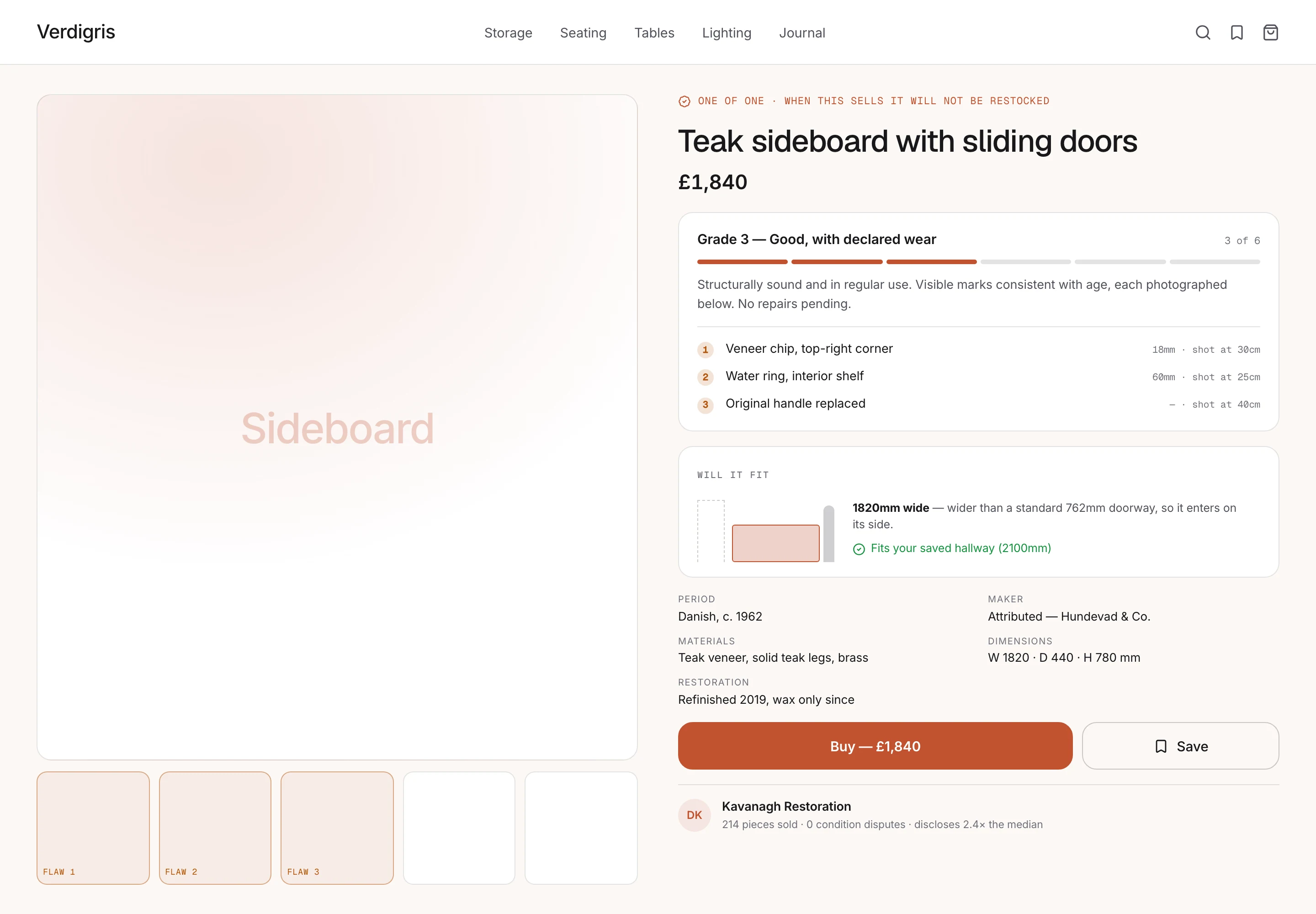
A concept study in marketplace design for non-fungible inventory — a vintage furniture platform where condition, scale and provenance are the purchase decision, and every conventional commerce pattern breaks.
- Project type
- Marketplace product design & commerce system
- Industry
- E-commerce
- Timeline
- 10-week scope · 2026
- Platform
- Responsive webSeller intake, mobile
- Services
- Product DesignDesign SystemsFrontend Engineering
- Technologies
- FigmaNuxt 4TypeScriptTailwind CSS
What made this hard
Verdigris is a scenario chosen because it breaks e-commerce conventions at the foundations rather than at the edges. Nearly every established pattern — size and colour variants, restock alerts, "customers also bought", review aggregation, comparison tables — assumes the next unit is identical to this one. When each item is the only one that will ever exist, those patterns are not merely unhelpful; several of them are actively misleading.
There are no variants, so there is no variant selector
The single most established component in commerce has nothing to express. What occupies that slot instead is the question the buyer actually has, which is whether this specific object is acceptable.
Condition is the product
For a mass-produced item, condition is a footnote — it is new. For a 1960s teak sideboard, the pattern of wear is most of what distinguishes this one from another, and it is what the price rests on.
Photographs cannot convey scale
The most common failure in this category is a piece that does not fit, or that dominates a room in a way the images never suggested. Dimensions in millimetres are accurate and almost useless to a person imagining their hallway.
Reviews cannot work
Nobody else has bought this item, so there is no social proof for the thing being sold. Trust has to be constructed from the seller's history and the quality of disclosure instead.
Scarcity is real, which makes manufacturing it worse
One of one is genuinely one of one. Layering a countdown on top of a true constraint corrodes the credibility of the true constraint, which is the platform's main asset.
Disclosure is against the seller's short-term interest
Every flaw photographed is a reason not to buy today. The system has to make thorough disclosure the easier path, because arguing that it pays off later will not survive contact with a dealer listing thirty pieces a month.
The situation we designed against
The premises describe a market where the decisive information is exactly the information a seller is least motivated to supply. Most of the design work follows from taking that conflict seriously rather than assuming good behaviour.
- The purchase decision is condition, scale and provenance
- In that order. Price is a filter applied before the decision, not the decision itself.
- Buyers have been burned and shop defensively
- We assume a buyer arrives assuming the photographs flatter the piece. The interface is read as advocacy unless it visibly works against its own interest.
- A photographed flaw builds more trust than a flawless listing
- The central bet of the project. Visible, specific disclosure reads as competence; an unblemished listing reads as either a very good piece or a careless one, and the buyer cannot tell which.
- Millimetres do not communicate size
- We assume almost nobody converts a dimension into a mental image reliably. A comparison against something known does the work a number cannot.
- Sellers optimise for listing speed
- A dealer listing thirty pieces a month will take whatever path is fastest. Disclosure has to be on that path, not beside it.
- Returns are catastrophic in this category
- A returned sideboard is a logistics event, not a postage label. Every pre-purchase question answered is disproportionately valuable.
The people we designed for
Neve Ashworth
Buyer, furnishing a first house
Browsing in the evenings over several weeks, saving pieces she cannot commit to. She was burned once by a listing that described a veneer chip as "light wear", and now reads every listing looking for what is not being said.
“Show me the worst bit. If you will not show me the worst bit, I assume it is bad.”
Goals
- Know exactly what she is getting before committing
- Understand whether it physically fits, and how it will feel in the room
- Judge whether the price is fair for this specific condition
Frustrations
- Vague condition language that means nothing consistent
- Flattering photographs at angles chosen to hide wear
- Dimensions she cannot translate into her hallway
Dermot Kavanagh
Dealer, lists around thirty pieces a month
Runs a small restoration business and lists from a warehouse on his phone. He is not trying to mislead anyone — he is trying to get thirty pieces online before Thursday, and every extra field is a reason to leave a listing in draft.
“I will photograph every scratch if it stops me answering the same three questions twenty times a week.”
Goals
- List a piece in a few minutes without a desktop
- Avoid questions in messages that the listing should have answered
- Have his thoroughness visible to buyers who are comparing sellers
Frustrations
- Long forms that assume he is at a computer
- Free-text condition fields where he has to invent his own vocabulary
- No credit for disclosing more than the seller next to him
Where the current experience loses them
Scroll the map horizontally to see every stage.
When the standard patterns are the problem
Most commerce design is a matter of applying well-understood patterns competently. Verdigris was chosen as a scenario because it breaks them at the foundation.
A variant selector has nothing to express. A restock alert is a promise that cannot be kept. Review aggregation has no subject — nobody else has bought this sideboard and nobody else ever will. "Customers also bought" implies substitutability that does not exist. Comparison tables assume shared attributes across fungible units.
Removing all of that leaves a large hole in the middle of the listing page, and the interesting question is what belongs there. The answer is the question the buyer is actually asking, which is not "which configuration do I want" but "is this specific object, in this specific condition, acceptable to me at this price".
That reframing is the entire project. Everything else follows.
Disclosure as a costly signal
The central bet is that photographing flaws builds more trust than hiding them, and it is worth being explicit that this is a bet with a real cost.
The reasoning runs through signalling. A defensive buyer — and the scenario assumes buyers are defensive, because they have been burned — reads every listing as advocacy. Beautiful photographs are exactly what a careless seller and a meticulous seller both produce, so they carry almost no information. The buyer cannot distinguish the two, so they discount both.
A close photograph of a veneer chip is different. It costs the seller something to publish, and only a seller who is confident in the rest of the piece will pay that cost. It is therefore credible in a way that no amount of reassuring copy can be.
The cost is that listings look worse. In a grid, beside a competitor that permits flattering photography only, a Verdigris listing is at a disadvantage. Some sellers will leave. The ones most likely to leave are the ones with the most to conceal, which is the intended selection effect — but a marketplace with fewer listings is a worse marketplace, and this decision would be under commercial pressure from launch.
Making the honest path the fast path
The disclosure system fails entirely if it depends on sellers being virtuous.
Dermot lists thirty pieces a month from a warehouse on his phone. He is not dishonest; he is busy. Any requirement that makes listing slower will be met by listings sitting in draft, and any policy that is enforced by moderation rather than structure will be gamed within a month.
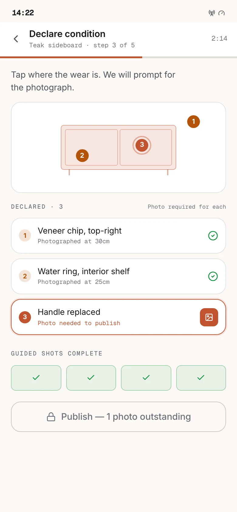
So the intake is guided capture: it prompts for the specific shots that answer the questions buyers ask, and flaw declaration is tapping a location on a diagram and taking a photograph. This is one step longer than the current free-text flow and materially faster in practice, because the slow part of the old flow was never the typing — it was inventing a vocabulary from nothing and deciding how to describe a chip.
The argument that persuades a dealer is not that disclosure builds trust. It is that photographing the scratch stops him answering the same three questions twenty times a week.
The decision most likely to be reversed
No countdowns, no view counters, no "two other people are looking at this".
One-of-one inventory is the most legitimate scarcity in retail, and the standard urgency toolkit is right there and would work. Adding it would raise near-term conversion, and someone will propose it in the first quarter after launch.
The argument against it has to be made in the right currency. It is not that urgency tactics are distasteful. It is that the platform's entire model rests on its condition grades being believed, and manufactured urgency is detectable. A buyer who catches one false signal re-reads every other claim as a tactic — including the grade, including the flaw photographs, including the measurements. The thing that gets spent is the credibility of the disclosure system, and that is the asset.
That is a hard argument to win against a conversion number, and it is the one this design is least confident of surviving.
What we decided before drawing anything
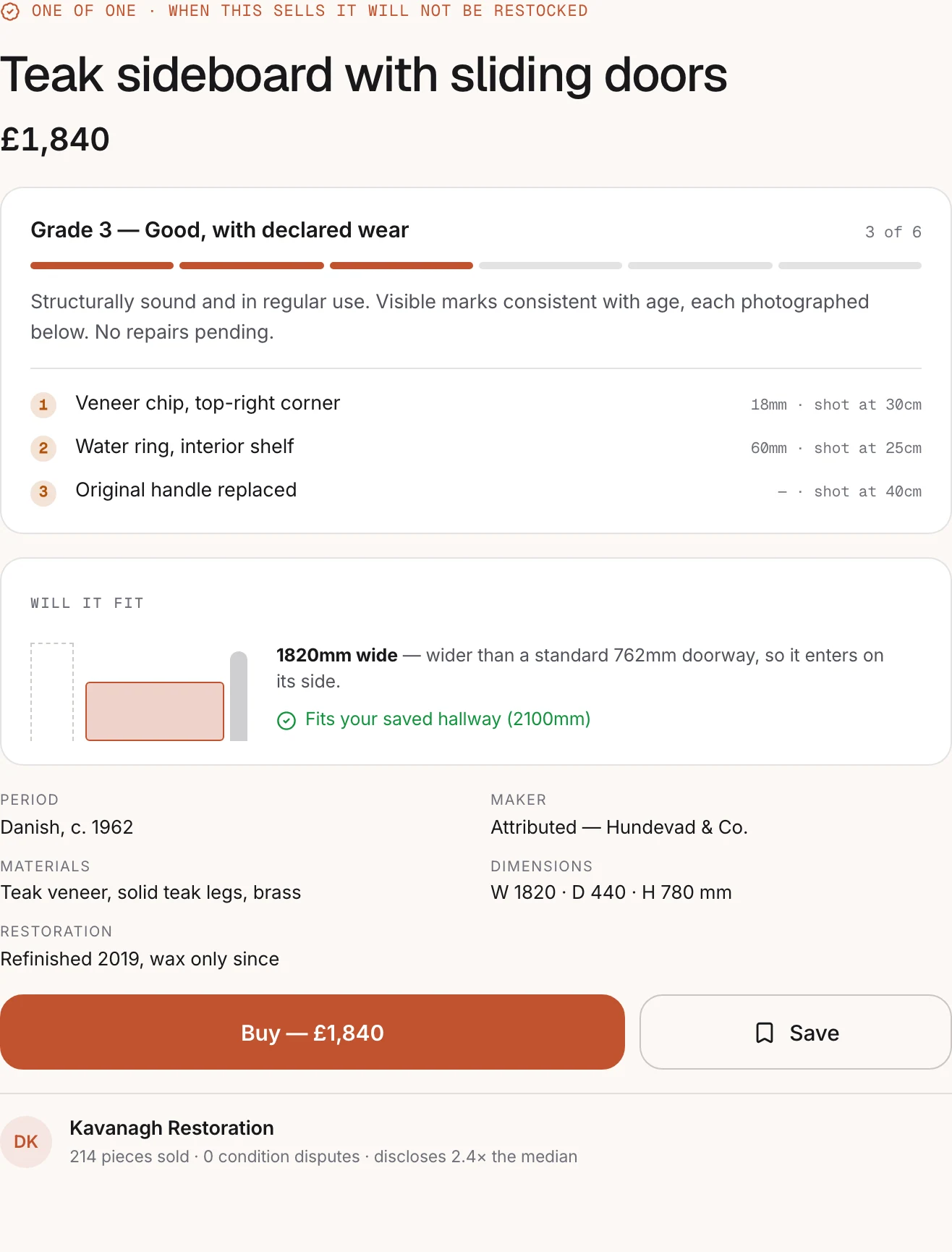
Lead with the flaw
Declared damage appears near the top of the listing and early in the gallery, not at the end of a description. A platform that shows the worst of a piece first is one whose photographs can be believed.
Every listing is the only one
No restock, no variants, no substitutes presented as equivalents. The interface never implies that another identical unit exists, because none does.
Dimensions must be felt
Every measurement is rendered against something known. A number alone is accurate and useless, and this is the failure that generates returns.
Scarcity is stated, never manufactured
One of one is a fact and gets one plain line. No countdowns, no view-counters, no "three people are looking at this".
Disclosure must be the fast path
If thorough listing is slower than careless listing, the platform will fill with careless listings regardless of policy. Structure and defaults do the work that exhortation cannot.
Provenance is structured, not prose
Period, maker, materials and restoration history are fields. As prose they are unfilterable, uncomparable, and quietly omitted.
How the product was reorganised
Discovery
Filtering on the attributes that actually decide a purchase, rather than on price and category alone.
Dimensional filters
Will-it-fit constraints entered once and applied across browsing
Condition grade
Filter on the fixed vocabulary, not on free text
Provenance
Period, maker, material — filterable because they are fields
The listing
One surface holding everything needed to decide, with disclosure above persuasion.
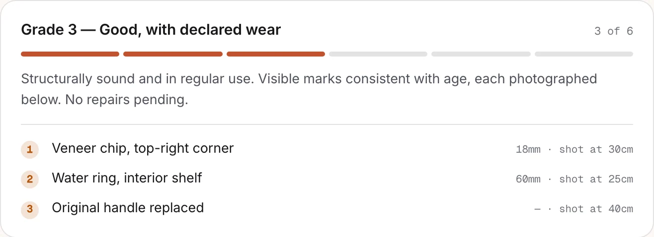
Condition summary
Grade, definition, and a map of declared flaws on the piece
Flaw gallery
Each declared flaw photographed close, at a stated distance
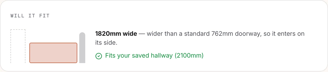
Scale
Generated comparisons against a figure and a standard doorway
Provenance timeline
Period, maker, prior restoration, ownership where known
Trust
Rebuilt from seller behaviour, because item-level reviews cannot exist.
Seller record
History, dispute rate and disclosure completeness
Disclosure score
How thoroughly this listing documents its own faults
Seller intake
Mobile-first, structured, and designed so the thorough path is the quick one.
Guided capture
Prompts for the specific shots that answer buyer questions
Flaw declaration
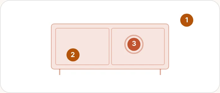
Tap the location on the piece, then photograph it
Measurement
Structured dimensions that generate the scale references
Before and after, step for step
Judging whether a piece is acceptable
The before column is forensic work the buyer performs on the seller's behalf. Every step of it is a chance to give up.
5 to2steps, −3
Before
- Read a vague description
- Zoom into each photograph hunting for wear
- Message the seller
- Wait for a reply
- Re-read the answer against the images
After
- Read the grade and its definition
- Look at the photographed flaws
Working out whether it fits
This is where pieces get abandoned, and it is entirely a translation problem — the data was always there.
4 to2steps, −2
Before
- Read dimensions in millimetres
- Find a tape measure
- Measure the space
- Try to picture the piece
After
- Read the scale comparison
- Check it against saved room constraints
Listing a piece as a dealer
One step longer than before, and faster in practice — guided capture replaces the part where he invents his own description from nothing.
5 to5steps
Before
- Photograph the piece
- Write a free-text description
- Guess at condition wording
- Type dimensions
- Publish
After
- Guided capture prompts each required shot
- Tap each flaw location and photograph it
- Select a condition grade
- Enter structured measurements
- Publish
The choices that shaped the product
Each of these could reasonably have gone the other way. What follows is the argument for the direction taken, and what it gave up.
A fixed condition vocabulary instead of free-text description
"Good vintage condition" means whatever the seller wants and whatever the buyer fears. Free text makes two listings incomparable, which is the single largest source of uncertainty in the category.
What we did
Six grades with written definitions and worked photographic examples, selected rather than typed, applied identically across every listing.
Why
A shared vocabulary makes listings comparable and makes the grade falsifiable — a buyer can check the piece against the definition, which is impossible with prose. It also removes the burden of invention from the seller.
What it cost
Six grades cannot describe everything, and genuinely unusual pieces get flattened into a category that fits imperfectly. Free-text notes remain, but they sit below the grade rather than replacing it — some nuance is lost, and the comparability is worth it.
Flaws photographed and shown first
Every incentive points at photographing a piece at its best. That produces listings a defensive buyer discounts entirely, which hurts the honest seller most.
What we did
Each declared flaw must carry a close photograph at a stated distance, and the flaw gallery appears near the top of the listing rather than at the end.
Why
Showing the worst first is a costly signal, and costly signals are the only ones a defensive buyer believes. It also answers the questions that otherwise arrive as messages, which is the argument that persuades the dealer.
What it cost
Listings look worse at a glance, and in a grid of competing platforms that is a real cost. There will be sellers who leave for a platform that lets them show only the good side, and the ones most likely to leave are the ones with the most to hide — which is the intended selection effect, but it does mean fewer listings.
Generated scale references rather than dimension text
Dimensions in millimetres are accurate and do not produce a mental image. Misjudged size is the most expensive failure in the category, because the return is a freight movement.
What we did
Two references generated from the measured dimensions — a human figure at average height, and a standard doorway — plus optional comparison against room constraints the buyer has saved.
Why
It converts a number into something a person can judge instantly, using the measurements the seller already has to supply. The doorway comparison also silently answers the question that causes the worst outcome: whether it will physically get into the house.
What it cost
Entirely dependent on measurement accuracy, and it makes a bad measurement look authoritative. Dimensions are therefore required at intake with a guided capture step, and a listing with disputed measurements loses the references rather than showing approximate ones.
Alternatives that state their difference, not "similar items"
A recommendation rail on a unique-goods marketplace implies substitutes that do not exist. Presenting a different sideboard as "similar" is a claim the platform cannot support, and it undermines the one-of-one premise the whole business rests on.
What we did
A rail of the closest available pieces, each labelled with how it differs — shorter by 200mm, one grade below, different period.
Why
It is honest about substitution being imperfect while still being useful. The buyer is comparing anyway; the platform may as well do the comparison accurately rather than implying equivalence.
What it cost
Stating the difference makes the alternative less appealing, which will lower engagement with the rail. That is the correct trade — a rail that works by obscuring difference is selling the wrong thing.
No manufactured urgency
One-of-one inventory is the most legitimate scarcity in retail, and the standard toolkit — countdowns, view counters, "two others are looking" — is available and would work in the short term.
What we did
One plain line stating the piece is unique and unrepeatable. No timers, no counters, no artificial deadlines anywhere in the funnel.
Why
The platform's asset is that its claims can be believed. Manufactured urgency is detectable, and once a buyer catches one false signal they re-read every true one as a tactic — including the condition grades the entire model depends on.
What it cost
A measurable amount of near-term conversion left on the table, and this is the decision most likely to be reversed under commercial pressure. The defence has to be made in terms of the credibility of the condition system, because that is the thing that would actually be spent.
Key screens
The system underneath the screens
An editorial, generous system built to let photography carry the page. Larger radii and spacious density, a warm neutral ground rather than the clinical white most commerce defaults to, and a condition component that is the only place grades are expressed anywhere in the product.
Colour
- Umber#17120FPrimary surface, dark theme — warm rather than neutral black
- Patina#E07A5FPrimary action, dark theme
- Patina (light)#C2532FThe same role restepped for the light theme
- Stone#71717ASecondary text, and the reference series in charts
- Declared#B45309Flaw markers. Informational, never a warning — a flaw is not an error.
Typography
- Piece titleThe name of the object, set lighter than a heading would normally be2.25rem · 500
- SectionCondition, provenance and dimensions headings1.25rem · 600
- BodyDescriptions and provenance notes, at reading measure1.0625rem · 400
- SpecificationDimensions, materials and structured provenance fields0.9375rem · 400
- GradeCONDITION GRADE — set in caps, one place only0.8125rem · 600
Tokens
- --grade-vocabulary
- 6 fixed
- The only condition vocabulary in the product. Free text may not replace it.
- --flaw-photo
- required
- Publication is blocked until every declared flaw carries a photograph.
- --scale-reference
- figure + doorway
- Generated from measured dimensions. Absent if measurements are disputed.
- --urgency-signals
- 0
- A build-time assertion. No countdown or view-counter component exists.
- --image-ratio
- 4:5
- Portrait by default. Furniture is taller than a landscape crop admits.
- --radius-surface
- 16px
- Softer than the operations tools — this is a browsing surface, not a console.
Components
6 components · 28 variants
- ConditionGrade6The six grades with definitions. The only place a grade is expressed.
- FlawMarker4A located flaw on the piece diagram, linked to its close photograph.
- ScaleReference3Figure, doorway and saved room constraint, generated from measurements.
- ProvenanceTimeline5Period, maker, restoration and ownership as structured, filterable events.
- PieceCard7Grid, saved, sold and reserved states. No restock or variant states exist.
- AlternativeRail3Closest available pieces, each labelled with how it differs.
Rendered specimens
What shipped
Six-grade condition system
A fixed vocabulary with written definitions and worked photographic examples, making two listings comparable for the first time.
Located, photographed flaws
Declared damage mapped onto a diagram of the piece and photographed close at a stated distance, shown before the beauty shots.
Generated scale references
A human figure and a standard doorway derived from measured dimensions, plus comparison against saved room constraints.
Structured provenance
Nine fields captured at intake, filterable across the catalogue because they are data rather than description.
Honest alternatives rail
The closest available pieces, each labelled with exactly how it differs rather than presented as similar.
Guided mobile intake
Prompted capture that makes thorough disclosure the fastest way to list, because policy alone will not survive thirty pieces a month.
What the work changed
These describe the design itself. Because this is a concept project with no users, there are no adoption, retention or revenue figures on this page — those would have to be invented, and an invented number is worth less than none.
- 6
- Standardised condition grades
- A fixed vocabulary with written definitions and worked examples, replacing free-text seller descriptions.
- 100%
- Listings requiring photographed flaws
- Publication is blocked until every declared flaw carries a close photograph at a stated distance.
- 4 → 1
- Screens to judge a piece
- Condition, dimensions, provenance and flaw detail consolidated onto the listing itself.
- 0
- Countdown timers or scarcity pressure
- One-of-one inventory is stated as a fact. Nothing in the interface manufactures urgency on top of it.
- 2
- Scale references per listing
- A human figure and a standard doorway, generated from the measured dimensions rather than illustrated.
- 9
- Provenance fields captured at intake
- Period, maker, materials, origin, prior restoration and four more — structured, so they are filterable rather than prose.
Next study
Halyard
A progressive delivery console that can answer "who is seeing this?"
Developer ToolsYour product
Have a problem shaped like one of these?
Verdigris is a concept. If you are working on something with the same kind of complexity, tell us what is not working and we will tell you how we would approach it.
Or email us directly at hello@uxatom.com